Elemis

Chloe


The Botanist

Jo Malone


All Saints


At the start of the session today we were put into work groups. We had seven people in our group. Taking it in turns we went round the group and presented our findings, why we had chosen them, commenting on the choice of typeface, colour and meaning behind the designs. I really enjoyed listening to everyone's ideas and found it beneficial to hear everyone's point of view.
Lorraine started the session by explaining the Nasa logo. This was an interesting introduction to the session. We were all given the logo printed out on an A4 sheet in black. However, it is also used in red too in certain circumstances. It was used in the 80's on shuttle machines.
We spoke as a year group about the choice of colour. It was suggested that red was used to express danger, as an astronaut's job is very dangerous. Their white suits are also representative perhaps of the American flag. The font that is used has a very futuristic 'space age' feel to it. The rounded letter forms were perhaps designed to be visible from a distance and they are tubular, which links to the tubes which connect an astronaut to the shuttle. The A and the S are connected which could be interpreted in a variety of ways:


Pan am

Elephant and Castle shopping centre


We spoke as a year group about the choice of colour. It was suggested that red was used to express danger, as an astronaut's job is very dangerous. Their white suits are also representative perhaps of the American flag. The font that is used has a very futuristic 'space age' feel to it. The rounded letter forms were perhaps designed to be visible from a distance and they are tubular, which links to the tubes which connect an astronaut to the shuttle. The A and the S are connected which could be interpreted in a variety of ways:
- Astronaut and space
- Astronaut and shuttle
- Astronaut and spirit
It is a successful logo because the audience interprets it correctly. They decided to rebrand however, as it was associated with people dying in the Nasa accident.
Having had this conversation, we then started our own presentations. Given roughly 3-5 minutes for each of us to explain our findings and then get some feedback too. Our discussion ended up being much longer than initiall anticipated, but it meant that we had some strong viewpoints and opinions to work with and discuss.
In note format I wrote down everyone's responses:
Ellen
Apple
- Few colours are used for simplicity and to reach a large target audience
- Sans serif fonts are used to maintain a modern feel
- Their designs defy age - Timeless products
- Maintained identity over the years and the logo wouldn't necessarily have to be present to be recognised as an Apple product
- Tone of voice is conversational and friendly
- Want to seem down to earth and approachable
Liz Earle
- Logo symbolises nature
- The teal used is calm
- Booklet is full colour
- Teal is fresh and clean whilst the grey is more clinical
- The serif font gives an established feel
- Atoms on logo pull science in to the design
Ogio
- Young sophisticated design
- Use the product to have the colour in the design (wine)
- Speaks for itself
- Non-exclusive
- Trendy
- The slant of the label represents pouring of the wine
- Red has a more mature style of branding
- The circular space represents the brand without actually needing to create a logo, but instead using the negative space to portray the wine
Next
- Used to be uppercase - perhaps tried to modernise their brand
- Reaches a wide audience
- The garden logo is easy to distinguish with the use of green to represent nature
- Friendly
- Universal logo which is in some ways similar to Marks and Spencer and Waitrose, who aren't trying to be exclusive or high end, but are that well established that they have loyal customers
Bagel Nash
- Image and type combined
- Rounded typeface
- Friendly
- Sans serif, soft feel
- The illustrative bagel could perhaps represent infinity
Me (Images at the top)
All Saints
- Bags are grungy and industrial almost
- Rams head represents death, and dark clothing
- Wants to reach a wide audience as their logo changes a lot
Jo Malone
- Don't need a logo, just simply text
- Upper class branding
- Simple and elegant
Botanist
- Reminds us of greenhouses
- Big fairs
- Crystal Palace
- Gardening
- Informal and humble design
Elemis
- Frosted glass could perhaps make the consumer imagine having a facial steam treatment or could represent a waterfall, linking the design to nature
- The letter E has a certain quality which could represent a wave or water
- Yin/Yang logo on their packaging using the 'e'
- The packaging is refreshing and inviting
Chloe
- Rosy colours used throughout their brand
- Subtle and elegant
- French fashion
Sarah Heal
Yobi Sushi Bar
- Ultra modern
- Geometric shapes
- Trendy
- Green represents the healthy food
- Triangles are used a lot to represent the shape of their food
- Presenting in an eco-friendly way, with an image showing their branding against a wooden slab
Snog
- Frozen yoghurt
- Fun
- Modern
- Friendly
- Used frozen yoghurt colours in their branding
- Chatty
- Maybe not aimed at children as one of their quotes says 'you'll never forget your first snog'
Four Seasons Hotel
- Business trips
- Aimed at men
- Not a strong brand
Clerkenwell Green
- Event company
- Eco-friendly
- Down to earth
- Cater for all settings
Grow London
- Eco-friendly
- Logo looks like it is growing, especially on the website
- Cosmopolitan
Harrison
Harrison had already looked at Nasa coincidentally, and so we decided to move on to his next example instead:
Writers Food Guild
- Simple design
- Clever use of negative space, illustrating the fountain pen as well as the spoon
- Black and white making it easy to replicate onto different coloured backgrounds perhaps
Pan am
- Blue globe
- Defines drive and ambition
- Blue represents the sky
Elephant and Castle shopping centre
- Negative space used once again
- Not a very strong choice of typeface used
- The image is effective however
Deus Customs
- Bikes
- Lines link to the machines
Pri
Puma
- Sports
- Active and alert
- The animal itself is active day and night, and therefore the sportswear should be worn day and night too
- Athletic
- Use lots of colours, their logo is versatile
- Quite a 90's style font
- Fluid font
Twinings
- Aimed at older audience
- Serif font
- Victorian
- Heritage
- Also used in bold
- Sophisticated and mature design
- Emblem is very British
Sony Vaio
- Analog and digital are brought together, reaching a wider audience
- They added the dot afterwards
Braun
- Proportionate
- Geometric elements
- The A could be interpreted in different ways
Pampers Kandoo
- Aimed at children
- Fun colours
- Strong name, a play on words
- Type looks like the frog, take a leap?
Joe
Hutchins Center for African and African American Research
- Strong logo
- Historic and sophisticated feel
- HA could perhaps link to Harvard as well as Hutchins Center
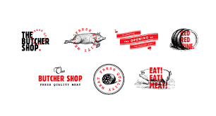
The Butcher Shop
- Red represents blood and fresh meat
- Typewriter business card style
- Made to look traditional
- Illustration of the pig is as real as it gets
NBC
- The colours are diverse and universal
- Negative space has been used to illustrate a peacock
- The peacock was simply used because it was colourful and all of the different colours used represent a different area of interest
- American version of the BBC
- Well established
- 70's style design
Belle Ninon Paris
- Sophisticated
- French
- Classy
- Classic colours used
- Serif works well with the French link
- They have managed to get away from the cliche script font to represent France
National Geographic
- The yellow square is taken from the border of the first ever magazine produced. It was then applied to the National Geographic logo in this way, and is now easy to recognise without even having the text next to it. The rectangle also represents capturing moments and framing them with a story, which is what National Geographic is all about.
Sarah
Up
- Management consultancy firm which has an arrow pointing upwards to represent the movements and progression they make
Bar Code
- Bar Code is an American chain which incorporated a bar code in their logo design, illustrating the main part of a mug
Wave
- Wave is a cosmetics brand which was actually really hard to read and it actually represented a surf brand more successfully
Knife
- Knife was a clever logo, as the designer incorporated knifes in to the text where they could
Horror Films
- Horror films is a clever logo, as a face is formed in the show reel to represent a scary face
After a break we then discussed our findings. We went round the studio and Lorraine asked each table about a particular logo we had found with interesting background history and meaning, our group chose to talk about NBC.
No comments:
Post a Comment