I found this session quite helpful, however I feel as though we could have either achieved more in the time we had, or should have had less time to complete the given work.
At the start of the session we had a briefing where we were told what we would be doing for the rest of the afternoon. We then went in to the studio and started the session.
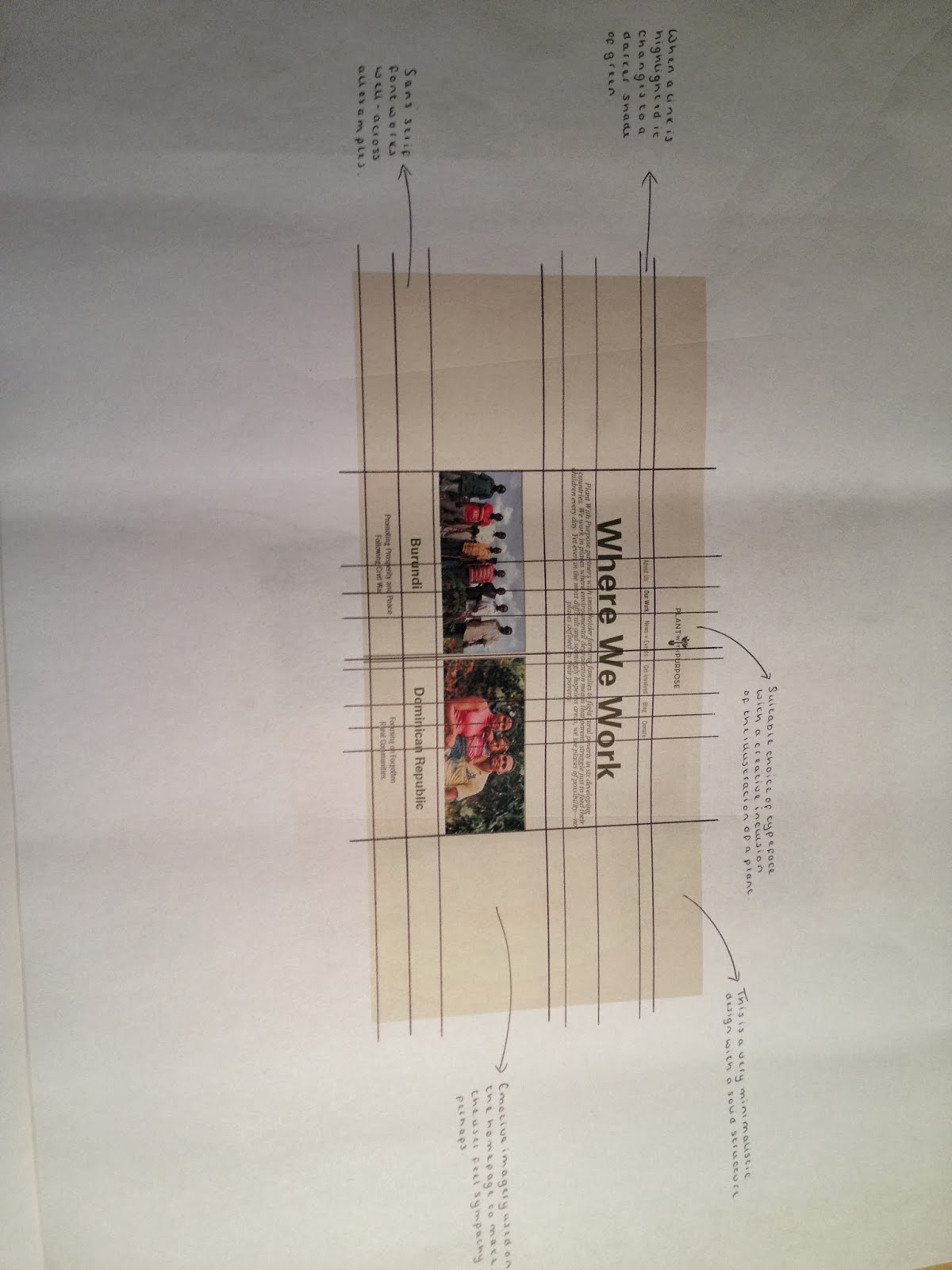
We started with Part 2:
Using our selected print outs of website design, we were asked to draw out underlying grid structures. We were given about 45 minutes to do this which seemed like quite a long time. I found it useful and it refreshed my memory concerning grids though. As I had some spare time after completing this task, I decided to start analysing the websites and making annotations on each one. This was helpful to me as I was able to observe any features that I liked and could potentially use on my own website.


Part 1:
We then had to produce a flow diagram to illustrate how our website would work when considering the links we would use for each of the pages. This was only a short exercise but it is something I need to strongly consider. I will be able to review my options when I complete the task for Simon next week which involves looking at scamps and designing my own relating to my own brief.

Having completed this exercise we were then asked to, as a group on each table, think about commonalities of navigation:
- scroll bar
- hyper links
- map
- links at the top
- read more button
- side bar
- drop down menus
- highlighted text
- next page
- previous page
- back to the top
- page numbers
- video previews (play button)
- thumbnails of images
- breadcrumbs
Then we had to think about uncommon examples of navigation:
- pop up ads
- no links
- menu at the bottom
- everything on one page
- not starting on home
- landing page
We then discussed our findings are a class to see whether we had thought of the same things. This was the concluding exercise to this session.
No comments:
Post a Comment