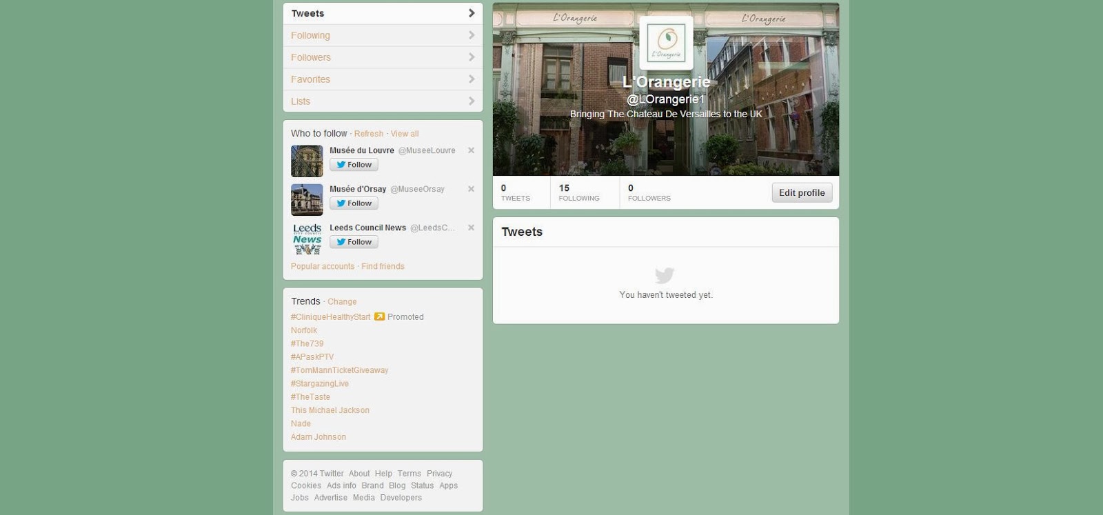
I have decided to create a wide range of products for L'Orangerie, all of which are connected to one of more of the senses. To start with I have thought of a few ideas, such as cake to taste, tea to taste, perfume to spell, paper which will also smell as well as pot potpourri. This is just a starting point for my work and as I start to work on this idea I am sure that the final range will become clearer in time.
I will be using this post to demonstrate all of the experiments and development I make along the way before reaching my final set of products.
Ideally I would like to create the following:
- Cake packaging
- Tea packaging
- Perfume packaging
- Paper packaging
- Envelopes
- Potpourri packaging (or included somehow to increase scent)
- Perfume blotters
- Business cards
- Promotional leaflet
- Room diffuser
- Carrier bag
- Scented drawer liners
- Anything else I think of along the way
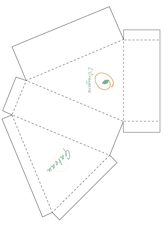
CAKE PACKAGING
At first I was unsure whether or not I should type out the name of the product in English or French, because it is reaching a UK audience. However, I have decided that once I have created the packaging nets then I will be able to create separate labels explaining what the product is exactly in English.
Below is a simple cake net I have used, placing the logo on one side and then the name of the product on the reverse.
CREATING THE PATTERN
Using grids I created this pattern with the logo and the orange segments.
APPLYING THE PATTERN
Here I have applied the pattern I created to the net for the cake. I also placed a white triangle over the top to place the text in to, inspired by the waitrose food packaging on my research post. I think that although this net works really well, for the final one I produce and submit I am going to have to create two nets which slot in to each other, because at the moment this isn't secure enough.
This is one of the prototypes I made with a thick green border around the edge, pattern along the sides and the segment still used behind the text. I am unsure about the segment idea and think I may just place it somewhere subtly as opposed to using the illustration, as it isn't obvious straight away what it actually is.
TEA PACKAGING
Rather than using the digitally drawn out orange I decided to draw it out by hand instead and then edit it digitally afterwards so that it was orange. I am really pleased with the outcome, and applied to the tea net it works really well.
PERFUME PACKAGING
At home I have a lot of perfume boxes and bottles which I have kept over the years to perhaps reuse one day. I found this one in my cupboard and it has to be one of my favourites. It is for After The Rain perfume and has been packaged using a drawstring bag with potpourri inside it.
Taking inspiration from this, I have created my very own perfume packaging. I went out and bought the ribbon and bags and then sliced orange potpourri up into small pieces to place inside.
I created a tester bottle as well as a standard sized bottle as well. At the moment neither of them have any text on and they don't have a label on the back listing the ingredients. I will do this however for the hand in.
PAPER AND ENVELOPES
When creating my paper and envelopes I decided to start with looking at a net. I found a simple net to use and then placed two green lines around the edge in the same way as I did on the perfume labels. Inspired by Jo Malone, I feel as though this works really well.
I then started to print all of the envelopes out on to ivory paper which I had also bought at the same time as the other materials I needed for this. I then carefully cut each one out until I had a set of ten.
I then experimented with the letterhead paper, placing the logo at the top to start with and then applying guidelines for writing. I decided that I didn't like this though because not everybody will want the logo on the front necessarily, and high quality writing paper doesn't usually have lines running across it.
So instead I created paper which is plain on one side and then has the print on the reverse side. When folded three times, it will fit into the envelope.
This is what the final result looks like.
DRAWER LINERS
I decided to create some drawer liners as I think this is a clever way of promoting L'Orangerie, as the customer will constantly be reminded of the brand every time they go in to their drawers.
Using my trimmer, I designed it so that the top and bottom edges have a pattern cut out of them, just to add a bit of a feminine touch.
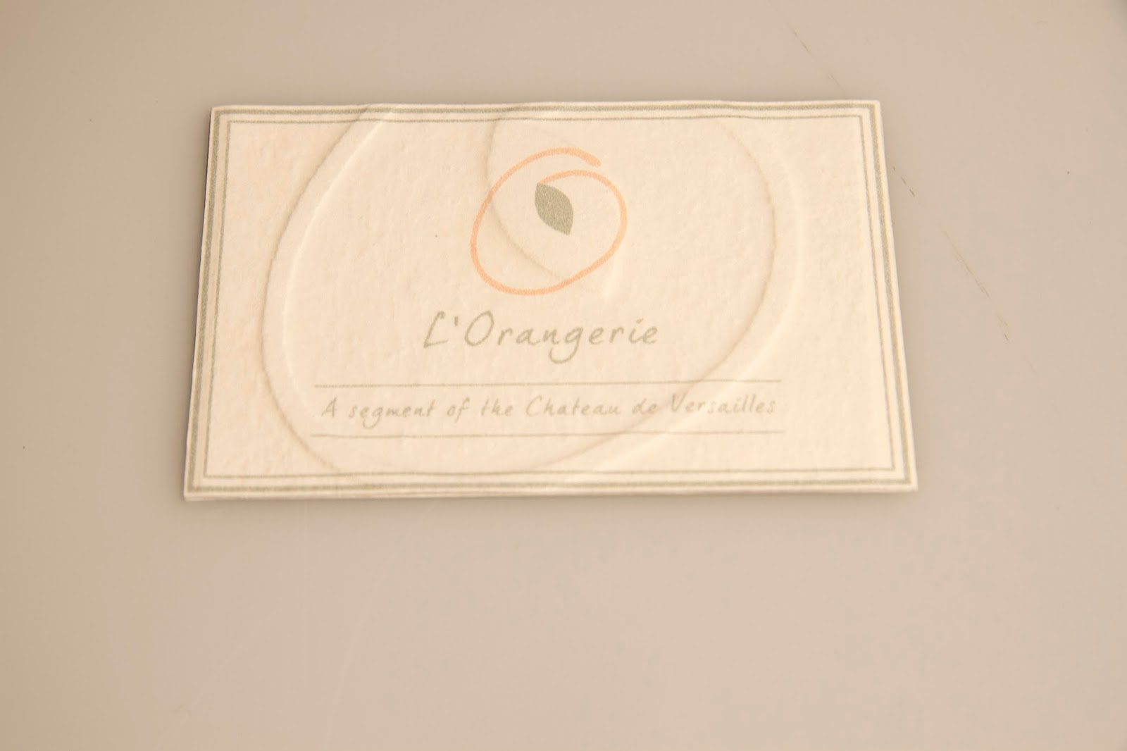
BUSINESS CARDS
I spent quite a while on the business cards, deciding which design to go with. As I have decided to eventually emboss my cards I am going to probably make the decision then, depending on how successful the outcome is.
This is how the embossing turned out and I am extremely happy with it. I am looking forward to getting everything finished and photographed so that it can all be seen as a set.
PERFUME BLOTTER
I printed off a range of different shapes and sizes for my perfume blotter and in the end settled on quite a thin and easily transportable one which isn't too big to carry around.
CANVAS BAG
As I am running out of time and have decided to include a canvas bag in my range of products, rather than just super imposing my logo on to the bag, I thought it would be worthwhile to at least iron the logo on. I tried it at first on a t-shirt to check to see whether it would work, and at first I didn't have the iron hot enough. However once I had increased the temperature it was successful and I am happy with the outcome.
RECEIPT
I designed a very simple receipt which is consistent with the rest of my work, applying a faded enlarged orange to the background to give it a bit of an added dimension.
LEAFLET
Using InDesign I created a promotional leaflet. I used the book on Versailles to gather information and then provided the customer with a short description of L'Orangerie as well.
LABELS AND CLOSURES
Below are some experiments with belly bands to wrap around my paper, as I was unsure whether to use ribbon or paper. However the bands weren't strong enough and I think even if they were to be reinforced using card they still wouldn't be very practical. Therefore I am going to use ribbon.

These are some design ideas for what the cake signs would look like in the shop (using the original orange just as a quick prototype). I quite like these designs, however I am not sure whether it would simply be easier, with it being a pop up shop, to just transport a blackboard or a reusable surface instead.
The following images are of me creating my final labels using a scalpel as well as the same pattern along the edges as the paper I made earlier.
HAND RENDERED EXPERIMENTATION
At one point during all of this work I thought about perhaps making it more hand rendered. However, this is something I have tried to resist doing because I have done it a lot in the past and want to try and broaden my skills a bit more, creating something which is a bit more digital. I didn't end up using these in the end, obviously they are quite rough. But I felt that the pattern I created was enough and anymore would have just looked a bit cluttered and over complicated.
SAMPLES
When I went shopping for the stock and all of the other materials for this project, I picked up a selection of ribbon as well. However since deciding that the green I originally used would be used on the final design, I didn't end up using any of these ribbons but instead found another one which I have used on the final products and is perfect.