Thursday 30 January 2014

OUGD505 - Design Practice 2: Studio Brief 1 (Initial Development)

Below are a lot of photographs of various pieces of development. I have been experimented quite a lot with my publication before settling on the final design and so thought it would be worthwhile to document all of the different stages and the changes that I have gone through. 

These are some photographs of the initial nets I created when experimenting with the packaging of the publication. I wanted to try and create something really different and memorable and certainly interactive for autistic children to engage with. I decided to print out a variety of different nets to start with and then construct them all individually to that I could assess which are the most successful and appropriate to use. 


This is just a simple box net which I thought would be quite appropriate, but it doesn't really fold out in any particular way so I don't think I will be using it for my final publication. 


I then created my own publication and net combined, using a box net and then placing all of the individual pages inside. I like this idea but I don't think it is appropriate for this brief. The first photograph demonstrates what the packaging looks like without the individual pages inside.


I then experimented with a fold out box shown below. I am really intrigued by this idea and think it could work really well. The net itself is really basic and I have included all of the individual concertinas on the inside. 


This is another concertina layout idea. The two concertinas are attached together and they fold away into a square. I feel as though this concept is a little bit too simple and not complex enough for me to develop my work and progress throughout this module. 


This is a really simple fold out which could work quite well within the box demonstrated above. Although I am not sure whether it is necessary for me to complicate the design by including something like this, as I feel as though the simple concertinas work really well.


This is just some really simple packaging which could include individual sheets of paper. Considering the publication is based on autism, I don't feel as though this idea is creative enough or interactive enough. 


Tuesday 28 January 2014

OUGD503 - Design Process 2: Responsive (Individual Practice Evaluation)

1. What skills have you developed through this module and how effectively do you think you have applied them?

I feel as though I have developed a lot of skills during this module. Being in control of my workload and having the responsibility to manage my time effectively and meet the deadlines set by myself has enabled me to grow as a designer and understand what is expected of me, and what will be expected of me when I graduate. I have managed to complete several live briefs for clients which has allowed me to develop my communication skills and I now feel much more confident when it comes to explaining breakdowns to clients in terms of cost as well as making sure I am regularly in contact with them so that they know the work is progressing. Being able to negotiate as well and not necessarily produce one of my preferred designs is something I have learnt to accept as well, as the client is always right and we have to give them what they want. 

2. What approaches to/methods of design production have you developed and how have they informed your design development process?

So far, for the clients I have been dealing with, as well as the Fedrigoni YCN brief, I have been working digitally. The final product for Fedrigoni will be produced using the laser cutter as well. I therefore feel as though I haven't had much of an opportunity to experiment with a variety of different finishes, however it hasn't ever been necessary or appropriate. I do feel as though in terms of production I have learnt a lot when dealing with printers. I have been in contact to get quotes for particular jobs and have been able to deliver the final product successfully to my clients. This is something I value highly, as it is so important to know how to deal with industry professionals and get the job done to a high standard.

3. What strengths can you identify in your work and how have/will you capitalise on these?

I think for each of the briefs I have completed I have shown a considerable amount of development. I feel as though this has been beneficial to me as well as my clients as I have been able to see how the initial idea developed in to the final product, which was considerably different in all cases. I think I need to make sure that I continue to work in this way, as it allowed me to identify the strengths and weaknesses with my design ideas, and this enabled me to produce final designs which I was happy with. I also think it is crucial to make sure that the client knows exactly how many changes can be made before the work is started, as the job can go on for too long otherwise and gets out of control.

4. What weaknesses can you identify in your work and how will you address these in the future?

I feel as though the way I presented my work in the final crit wasn't as professional as it could have been. I need to make sure that I concentrate on this for future briefs and revisit any that I have already done, to be able to use the work I have done and include it in my portfolio. I also still feel as though I could complete more live briefs and so I am going to make sure that I do this before module submission.

5. Identify five things that you will do differently next time and what do you expect to gain from doing these?

- I am going to continue to work on my time management, as this is something that can always be improved. Through doing this I will make sure that I take the time to balance between working on several briefs at once, as opposed to trying to get them done one at a time, as I feel as though this has worked for me so far.

- I am also going to try and work on more live briefs which involve a wider variety of outcomes, as this will benefit me in the long run when I am showing my work online.

- I am hoping to be able to use different production methods in the future, and perhaps be in contact with even more printers in Leeds to gain a larger contact list.

- I am going to photograph my work professionally.

- I will also organise more crits as I think they are invaluable and so worthwhile even if they only take up 15 minutes out of my day.


6. How would you grade yourself on the following areas:

5= excellent, 4 = very good, 3 = good, 2 = average, 1 = poor

Attendance (5)
Punctuality (5)
Motivation (5)
Commitment (5)
Quantity of work produced (4)
Quality of work produced (4)
Contribution to the group (4)

Tuesday 14 January 2014

OUGD504 - Design Production: Design For Print and Web (Web Resolution)

As my pop up shop lends itself more to print than it does to web, I had to consider my options quite a lot when it came to designing for screen. I decided that I would design a Twitter page and a Facebook page, as people will be using them for the foreseeable future. I also decided that I would create a website which is just one page and exists as a form of advertising for the pop up store. I therefore want it to be really clean and simple. In a similar way to the Yorkshire Soap Company and The Imaginarium, I would like the visitor to have to go to the shop itself to experience it and buy the products inside the shop as opposed to online, which is why I will just be providing the customer with imagery online and relevant information about where the shop will be situated throughout 2014.

TWITTER

The twitter page is just really simple and easy to follow. it would be used to keep all of the customers and people interested informed of any new ranges that are coming out. 


FACEBOOK

In a similar way, the Facebook page would do the same but I could create albums with all of the images organised.


WEBSITE

My website therefore is a very simplistic web page which is all on one page with links to Facebook and Twitter. 

Scamp

Unfortunately I haven't had as long to produce my website as I would have liked. However, having said that I did not feel as though my shop needing a huge website to support it, as I want the interior to be a mystery to encourage people to visit. 


Wireframe

I have created a simple linear wireframe to work with so hopefully it will be fairly straight forward to apply all of my imagery and text.


This is what my final website looks like. It is very miminal and doesn't have too much information on it, because I would rather my customers use the Twitter and Facebook feed as well as the website to find information, as this would be easier to keep up to date on the move from one location to the next.


OUGD504 - Design Production: Design For Web Development

INITIAL THOUGHTS

When we were given this brief I struggled initially to think of what exactly I wanted to base my website on. This is because I had researched in to plastic packaging, however I didn't think I could make a very interesting website without it getting too scientific. I therefore concentrated on looking at sugar cane instead and how it is used in packaging. During the studio session we were asked to come up with some ideas, mine are shown below.

I covered an idea for sugar cane packaging, for plastic and sugar cane compared to each other and then for sugar cane packaging and its other uses as well. I was quite unsure about which route to go down for this and found it really hard to know which one to choose and develop because we haven't yet had much web experience.


FURTHER DEVELOPMENT

I then decided to write down the pros and cons with each of the different ideas to help me make the right decision. 


I had a small crit with an industry professional and we spoke about looking for a gap in the market to fill. There is a lot of primary research that I have which may come in useful now as I could relate to Mauritius and Thailand where sugar cane is produced.


INITIAL THUMBNAILS

Below are some illustrations of all of my initial thumbnails. I filled a whole page of A4 for each of the web pages to try and illustrate as many ideas possible before settling on one. 


INITIAL SCAMPS AND WIREFRAMES

When I drew out all of my initial scamps and wireframes I didn't really know how hard it would be to code it all. I designed it so that each of the pages had a different grid layout and as a result it lacked consistency. During the presentation/crit I presented this work and whilst watching all of the other presentations it became apparent to me that the more consistency the better.


ILLUSTRATIONS

I wanted to try and make my website look hand rendered in a similar way to the Rewined website. I therefore drew out a variety of different objects which I could use. I didn't draw out all of them though, as I wanted to experiment first to see if it would actually work.


SUGAR EXPERIMENT

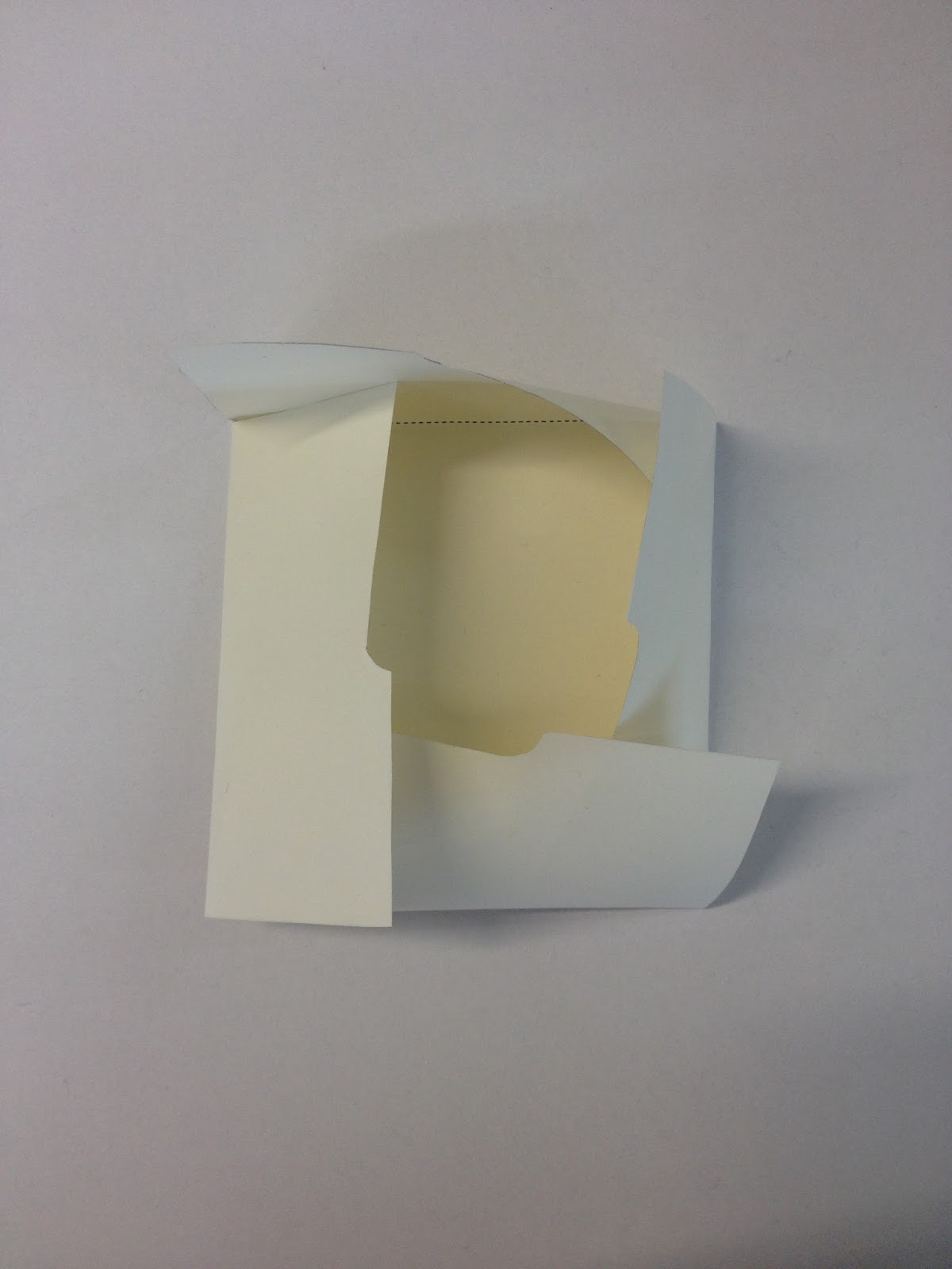
I had an idea to experiment with using sugar to create a typeface for my website as well, and so I had a go at doing it. I printed out the text to A4 scale and then simply placed glue over the text, sprinkled the sugar on top and then poured the excess away.  Although I really love the effect this has, I am not sure whether or not it is suitable for web, especially as this is the first one I have ever made and I don't want to make it look amateurish.


EXPERIMENTATION WITH LAYOUT

I have experimented extensively with layout, mocking up my web page on Photoshop to see what it would look like when produced properly. I did this experiment with imagery I had from Thailand and scanned some brown paper in to place in the background. I then used a dashed line and some decorative text to label each of the images. I thought this might be quite an interesting way of presenting information in a similar way to many organic looking websites.


Below are a range of different home pages I designed using photography and illustrations accompanied by text. When I applied a lot of my hand rendered work, I thought it looked a bit too disorganized and it didn't really work in the way I had hoped it would. I persevered for a while and kept trying different layouts but it started to look like I hadn't really thought about grid and layout and instead it was quite inconsistent and hard to use (not very user friendly).


FIRST WEBSITE EXPERIMENT

As I was so unsure about how to build a website to make it look along the same lines as the Rewined website, I took it upon myself to get some more primary research and got in touch with someone I know who has had experience with building websites for a long time. I was shown how a lot of websites are made up of lots of images, and when you want things placed in a specific way, this would be the way I should create my website. Rather than mimicking the Rewined website completely I tried to make it my own. So I used green along the nav bar and kept it consistent with the logo and text as well. I quite liked this design but was still not happy with it and felt as though I really needed to reconsider my layout choice.


FINAL WEBSITE DEVELOPMENT

Below are the images of my website development which I took to my crit with me. It has changed to become a lot more simple than my previous idea because it would have been impossible for me to code it all. On these examples I have placeholder text because I haven't yet had the chance to write out all of the information I need to apply. I have also got an illustration of sugar cane for one of my roll over images which needs changing as well to represent 'process' in more of a generalised way, as at the moment it is hard to even tell that it is sugar cane at all. 

I am really happy with the layout of each of my pages and how they are all much more consistent in comparison to my previous idea which was much more complicated. I have been able to apply the same grid layout to each of the pages.


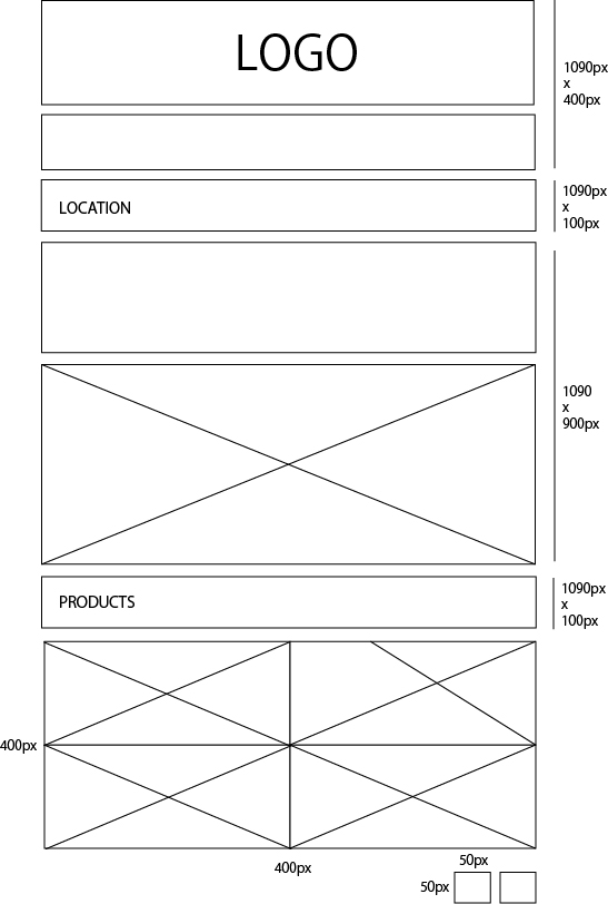
FINAL WEBSITE SCAMPS AND WIREFRAMES

Below I have had to recalculate my scamps and wireframes so that they are accurate. The first wireframe is the same for every page apart from the home page which makes it easy enough to calculate. Whilst the home page has separate calculations. 


FINAL WEBSITE

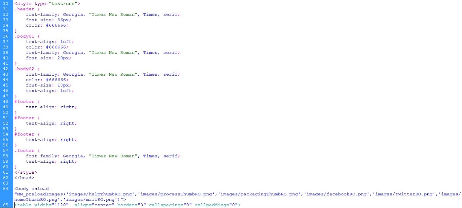
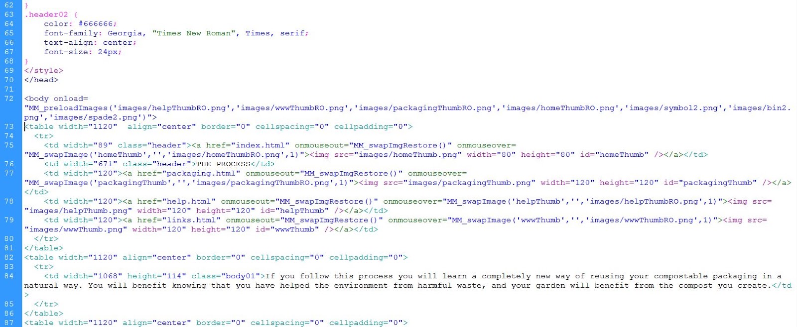
Below are all of the screenshots taken from my website, with all of the coding for each page. The coding is quite self explanatory and all of the images on there were created to the correct dimensions using the correct colours on Photoshop. 


ALL IMAGES USED