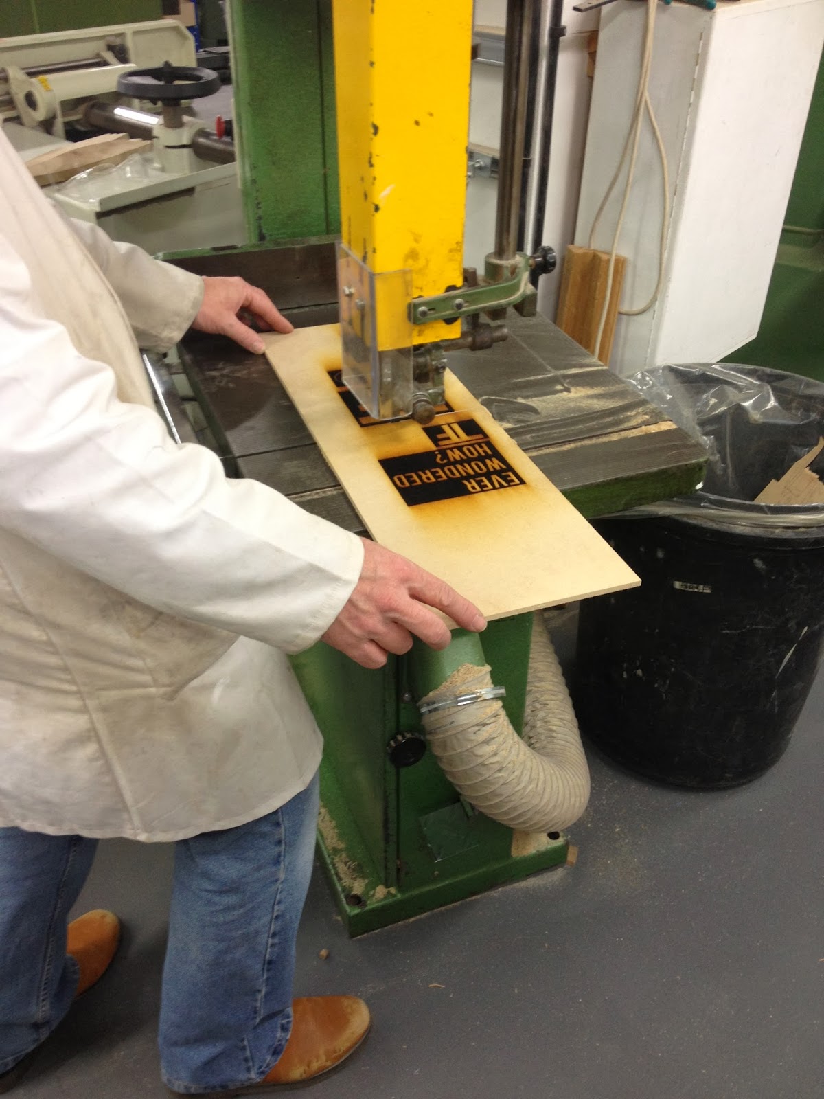
Showing posts with label Design For Print and Web. Show all posts

Tuesday, 14 January 2014

OUGD504 - Design Production: Design For Print and Web (Web Resolution)

As my pop up shop lends itself more to print than it does to web, I had to consider my options quite a lot when it came to designing for screen. I decided that I would design a Twitter page and a Facebook page, as people will be using them for the foreseeable future. I also decided that I would create a website which is just one page and exists as a form of advertising for the pop up store. I therefore want it to be really clean and simple. In a similar way to the Yorkshire Soap Company and The Imaginarium, I would like the visitor to have to go to the shop itself to experience it and buy the products inside the shop as opposed to online, which is why I will just be providing the customer with imagery online and relevant information about where the shop will be situated throughout 2014.

TWITTER

The twitter page is just really simple and easy to follow. it would be used to keep all of the customers and people interested informed of any new ranges that are coming out. 


FACEBOOK

In a similar way, the Facebook page would do the same but I could create albums with all of the images organised.


WEBSITE

My website therefore is a very simplistic web page which is all on one page with links to Facebook and Twitter. 

Scamp

Unfortunately I haven't had as long to produce my website as I would have liked. However, having said that I did not feel as though my shop needing a huge website to support it, as I want the interior to be a mystery to encourage people to visit. 


Wireframe

I have created a simple linear wireframe to work with so hopefully it will be fairly straight forward to apply all of my imagery and text.


This is what my final website looks like. It is very miminal and doesn't have too much information on it, because I would rather my customers use the Twitter and Facebook feed as well as the website to find information, as this would be easier to keep up to date on the move from one location to the next.


OUGD504 - Design Production: Design For Print and Web (Final Products)

Yesterday, I collaborated with a friend who is a second year photography student at LCA and she helped me to photograph all of my work. This was a great help as I have little experience with photography. When I received the photographs today they had a bit of a yellow tint to them to I have tried my best to brighten them up a bit on Photoshop. I am happy with them though as they show each product individually and showcase my work well.


OUGD504 - Design Production: Design For Print and Web (Proposed Design)

When considering anything extra I could propose for my shop I thought about a uniform. I wanted it to be as simple as possible which is why I have simply applied my logo to a cream apron. 


I also did the same with a candle, as this is a range I could most certainly extend. I think if I had more time I would love to continue designing more and more products as the possibilities are endless for this L'Orangerie concept.


This is what I would use to transport all of the goods for L'Orangerie. Originally I had something a little bit more fitting with the shop in mind but this wouldn't have been practical as it needs to be a reliable form of transport.


I also took a photograph of the canvas bag I printed on to and wanted to show how it would be used to carry products from L'Orangerie.


OUGD504 - Design Production: Design For Print and Web (Materials and Stock Choice)

When I went out and bought all of the materials I needed for this brief I took a few photographs of some of the choices I had to make. Below is a photograph of all of the ribbon I looked at in one of the shops, however I decided to buy the one on the far right in the end as it was most appropriate.


I also considered buying this to relate it back to nature and the garden a bit more but it was the wrong shade of green.


This tissue paper caught my eye and made me think I could create some tissue paper as well. However I had already got some orange and cream tissue paper at home that I was going to use, and I don't think I would have had the time to print on to it really. I am not sure whether it actually would need anything printing on to it though, as the pattern is used so much on my packaging anyway.


I looked at this paper as well as I liked the texture, but once again it wasn't the right colour.

OUGD504 - Design Production: Design For Print and Web (Hand In)

I have chosen to present my final products in the basket which would be used to shop in L'Orangerie. I have wrapped it up using cellophane to reflect how flowers are wrapped up in florests. I sprayed the tissue paper underneath the basket in the end to make the products smell as I didn't want to ruin the quality of the products by smudging any of the ink. 


Monday, 13 January 2014

OUGD504 - Design Production: Design For Print and Web (Photographing Final Product)

Today I was fortunate enough to be able to collaborate with one of the photography students who helped me take photographs of all of my work. It took a lot longer than I had anticipated, but I am really happy with the final outcomes and look forward to seeing them once they have been put on to the computer.

At the start I tried to lay all of my products out with the bag on the left hand side and all of the other products to the right or below. I wanted to try and create a rectangle with all of my products to make it look neat and balanced. I spent quite a while moving the products around to try and make it look right.

I then decided to move the bag in to the centre and put all of the other products around it. This was much more successful. The photographs came out really well, however because a lot of my work is three dimensional there were a lot of shadows on the photo, so I suggested that we used another light on the other side to counteract the shadow and it worked. This allowed the photographs to be much clearer and focused on the product rather than the dark shadows they were producing.

I will be posting all of the final photographs as soon as I receive them, and will be applying them to my final design boards as well as my website. 


Friday, 10 January 2014

OUGD504 - Design Production: Design For Print and Web (Laser Cut and Embossing)

Laser Cut

As I have printed all of my products out digitally, I thought it would be worthwhile to experiment a bit with embossing. As time is limited, I shared a laser cut slot with Ellen, we had booked in for one hour but ran over slightly. Below are some photographs of us setting up the document on the computer. We had to create outlines first and then import the files as jpeg images.


We set it up and let it run its course whilst continuing with some more digital design work on our laptops. I was really impressed with the outcome of this and had previously thought that my L'Orangerie logo may not work because it is so fine, but it turned out that this made it even more successful.

Having learnt from past experience, we used a piece of wood which wasn't too deep so that when it comes to emboss the design on to paper, it won't need as much pressure.


Once we had run the machine over our work twice to make sure that it had engraved deep enough, we then took it to one of the technicians who helped us to cut all of our work down to the correct size so we were able to use it to emboss.

Looking back in retrospect we should have spaced the work out in a bit more of an orderly manner, as this would have helped us when embossing later on. 


I produced the same logo at three different sizes and when it came out it looked like this. It obviously needed a good clean, but it was also noticeable that the wood surrounding the laser cut logo was actually flaking away, and therefore needed removing. I wondered at first whether or not to do this because the wood had already been cut in to quite deeply and therefore the outcome of my embossing would already be successful. However, at the rate it was falling away from the wood it made sense to sand it all down because otherwise my work would have been left marked.


Here the effect of sanding it down is obvious and demonstrates that it was a successful choice. It also made the logo stand proud and provided me with an even stronger block to use when embossing at the end of this procedure.


This is what my final three blocks looked like once I had finished sanding them all down. I am really pleased with how crisp they look and cannot wait to try them out on my work. I am just hoping that they are as successful as I would like them to be, as ideally I would love for the business cards to be embossed.


Here it is obvious where all of the grain has been removed, and it also demonstrates how closely the laser cutter has engraved the logo out of the wood.


After using the sand paper to remove any loose wood, I then used a sanding block and rubbed over the top of my design to make sure that the logo was completely clean and ready to use.


This is the final result and is now ready to use to emboss my work.


EMBOSSING

I went to Vernon Street to use the hydraulic press which I also experimented with for my print brief. I therefore knew how to use it, it was just a case of trying to produce as many samples as possible in the time available on the day. 


OUTCOMES

I am really pleased with the outcome of my experiments. To start with I used the paper which I have used to print all of my products out on to, which is 120gsm ivory paper and this is the result I got below. I noticed that the smaller the woodblock, the more likely the paper is to crease around the edges, whereas the top example worked perfectly. 


I took two pieces of paper with me, both with my business card fronts printed on eight times. I then lined up the wood blocks underneath as many times as possible to try and get the best result. The one which stood out to me the most was the largest logo. I am really pleased with the outcome and think that the way it runs off the edge of the paper works perfectly to add another dimension to my work and to also demonstrate the versatility of my logo. I also love how the grain in the wood has left an indent in the paper which I think reflects the texture of an orange, this is extremely appropriate.


Below are two more photographs of the samples I produced which worked well, both of which are the created using the largest woodblock. I have decided that I am going to use these for my final product and hope that when it comes to me cutting them out, mounting them on card, and then adding the backs of them on, that they will look just how I am hoping, because essentially this is how L'Orangerie will be promoted throughout the year travelling around the UK, as well as any promotional material.