Below is all of the development for my flash cards. I experimented with placing a tab on the left hand side with the header on it. I also liked the idea of having a red border all the way around it.

I then experimented with placing all of the traffic lights in an order and numbering them. This looks a bit too crowded so I think I may have to simplify the design a bit. I also feel as though I have tried to provide too much information on one card so it is a bit of an overload of information.


I then experimented further with the layout. I wanted to see what it would look like if I was to place the images so that they were meeting an edge of the paper. I'm not sure about this though as I think all of the images need to be consistently placed in the same situation.

When developing my flash cards I designed them on an A3 sheet so that I could look at them all at the same time and make comparisons. This top example is still very all over the place and doesn't have enough structure. It is important that I maintain a consistent structure within this design work, as it means a lot to autistic children.

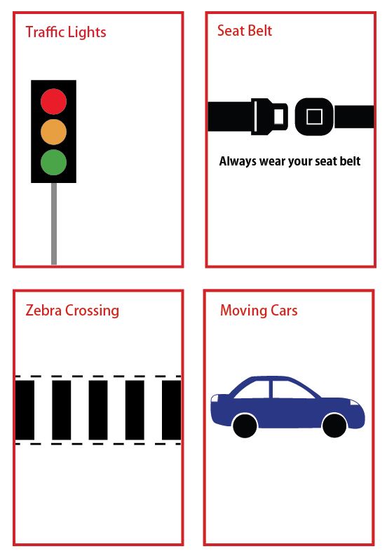
So far, this is my preferred choice of layout. All of the flash cards are consistent and work well visually. I may make some minor changes to these designs before printing them out but at the moment I am quite happy with this development.


I then considered how the cover flash card could be illustrated. I thought about how I could incorporate a car chair with a seat belt, so that when I put the belt around the flash cards, it would sit over the lap area on the image. I have a feeling that this may look a little bit tacky and unnecessary though, and so I think I may just keep it text and image based using the Road Safety Awareness logo that I have developed.


No comments:
Post a Comment