For my design and print I have decided to focus on the Not Just Fleurons brief. I have rewritten the brief as shown below so that I am aware of exactly what I need to produce as a resolution. I wrote it out roughly to start with and then refined it when I typed it up on the computer.
I have always loved creating packaging and think this is something I am extremely passionate about and will pursue in the future as a specialism. I have decided that I am going to focus on print for this brief, and then propose my website or perhaps try and build it if I have the time.
This post is to indicate all of the decision decisions I make and I will be using it as an ongoing post to document my work.

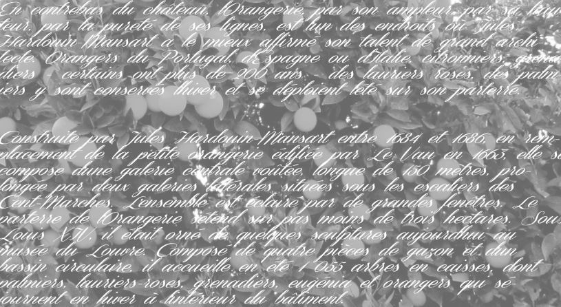
For this brief I have decided to look at the Chateau de Versailles and I want to try and find a really special way of celebrating their gardens. I looked on their website and read all about the different gardens there, then found that the most information that I was given was about the orangery there, which is why I have decided to make this my main focal point. I then wrote down on a spider diagram some key information about the plants and possible fragrances I could produce using these plants.

I then started to think about how I could take the idea of creating a scented range of products and expand it as far as possible. Some of the initial ideas I had are listed below, there are a lot of different products here but I think it will be possible for me to create the majority of them, given that I manage my time appropriately.

When thinking about the layout of my shop interior I started to then think about whether my shop should be situated in one place or whether it should travel around the country in the form of a pop up shop. I therefore carried out some research in to pop up shops which can be found on a separate post and decided to go ahead with this idea and develop it even further. I thought about how I could perhaps go as far as proposing the set up of the interior, however this is something which isn't as important as the products themselves, as the shops will vary depending on location and the layout will change at each one due to the space provided.
UPDATED CONCEPT AND AUDIENCE
By creating a pop up shop which can travel around the UK, I am able to then essentially bring the Chateau de Versailles to all of the UK population who are perhaps not fortunate enough to be able to travel there and visit, and so instead I could try and bring the gardens to them.

I then wrote down a list of inspirational places which I need to research in to on a separate post. These are all places which I feel could help me decide on what I would like my shop to look like and feel like on arrival. I would love to create a shop which combines all of these influential shops together to create a really unique concept.

When I researched into the pop up shops I then started to think about location. I considered placing it in my home town Ormskirk, because at the moment it is in need of new shops. However I am not sure whether or not this is enough of a reason for it to be situated there. I think this is something I can think about in more depth once I have finished designing all of my products and have started to think about shop fronts a bit more.


Below is a list of various different ways I could approach this brief. I could go down so many different routes or try to combine all of the ideas together for a unique experience, I think this will come clear when I start designing properly.


I then looked at the ideas I had from researching my idea a little bit further. I considered how I could somehow relate the anatomy of an orange to the anatomy of type, as it is a typographic brief.

LOGO DESIGN
Having thought about a lot of different aspects relating to this brief and my final outcome I now feel as though it is time for me to start designing. Now that I know I am naming my shop 'The Orangerie' I have drawn out a selection of different logo designs which I could choose from and create digitally eventually.
I tried to combine the letter 'T' and 'O' together to create my logo, however I am not sure whether it will work or not, I will have to try it digitally. All of my designs are clearly annotated and show where my ideas are going.


Using Photoshop and Illustrator I had a go at creating something a bit different, using photography and masking the letters, even using an orange photograph on one example. I realise now that this isn't appropriate for my shop as it wouldn't be suitable but it was just an idea that I wanted to experiment with first before dismissing completely.


I have started to develop my hand rendered drawings into digital designs. I started by trying to combine the 'T' and the 'O' together to represent The Orangerie. I adapted the letter 'T' by drawing a line to create more of a stem. I quite like this idea but feel as though it looks imbalanced at the moment.

I then developed the idea slightly by changing the letter 'O' to orange so that the image would work alone and the text would work alone, and could be applied to products without relying on the other.

To allow the imagery to work better on its own I decided to experiment with placing a box around it . I like the effect this has but I am not sure whether it is appropriate and it definitely needs further development.

On Illustrator I quickly drew out an orange to apply to the centre of the letter 'O' to see whether this would have a positive impact on the logo. I also elongated the stem, but I really don't think this works.

I also tried it with a more hand rendered orange but this looks even worse and is not a strong identity at all.


Once again this is another variation with the letter 'O' filled to represent the orange. It is simple, striking and memorable.

Very similar to the previous design, this logo has an additional leaf on it to make the letter merging a little less obvious to make people think when they look at it.

Here I have created a print with the text in a similar way to the All Bar One paper I blogged as inspiration. I think this would work well if it was refined further, however I don't think it works well for the look I am going for.

Rather than applying a square box around the logo, here I have applied a circle to represent the orange. This is much better than my previous idea and I feel as though I am getting somewhere.

I much prefer this idea. I didn't feel as though I was getting anywhere with combining the letters to make them resemble an orange, and I think that the more simple my logo is, the better.


The photograph below is of the boxes which are used for plants at the Chateau de Versailles. I wondered whether I could create a logo inspired by the shape of these boxes, and have experimented below. I feel as though this wouldn't go anywhere if I continued to develop it, and so I have decided to push it to one side.


The solid circle used to represent the orange as well as the letter 'O' in this logo means that the logo can work as two separate entities which would allow me to apply it to my products in a variety of different ways.

As there are lemons within the orangerie I thought I would play around with the idea of filling the circle with block colour to represent a different plant and see whether it would work across a variety of ranges of products. I think it does work really well, however I think that by giving myself too many ranges of products to focus on, I will put more pressure on myself and will not necessarily produce the most successful resolution to this brief.
I have therefore decided that within the orangerie there would be a variety of different ranges of products, each stemming from the scent of lemons, pomegranates and oranges, however the first range in the shop would be the orange range (to reflect the name) and this will be the range that I focus on.

Continuing with my logo designs I tried incorporating the imagery in with the text rather than creating it as a separate feature. I don't think it works well at all though.
I thought it might create quite a strong logo if I was to design the logo so that the text followed the shape of the orange, but it doesn't really look right and looks as though it would need more text on the bottom half of the circle to make it look complete.

I tried using a completely different font. Up until now I have just been experimenting with Times New Roman as I thought a serif font would be quite appropriate for my shop. However I have now realised that this is where I was going wrong, because it actually created too much of a corporate feel. I need to be able to represent Versailles with my logo and it needs to have a French feel to it.
Here I have started to use a more decorative font which is a bit more playful and soft. I think this works much better and I am going to continue experimenting further until I am happy.

As I have used the previous font before now on a different project, I wanted to try and experiment with something new. I used the font below instead, although it isn't much different I have chosen it because I think the two could perhaps work together in some way eventually as they compliment each other really well.

Reverting back to one of the designs I wasn't so fond of, I wanted to try and see whether it would be stronger using the changed typeface. I feel as though it has improved the logo but still isn't working.

Taking a more modern, minimal approach, I decided to draw some simple lines on Illustrator which could represent an orange whilst at the same time represent the 'T' and the 'O' for the orangerie.
This first logo could do with a bit of supporting text.

I have applied some text to run along the shape of the 'T' but I'm not sure it works as the stroke of the illustration is too thick for the chosen type.

I thought I would experiment with lower case typography instead and instantly think this works much better as it is a lot softer and in keeping with the shop I want to create.

Although I love this typeface in lower case I don't think it works well with the image. It is also important to note that as I have made all of this progression I have been experimenting with tracking and kerning in to increase legibility.


By combining the drawing in with the text and reducing the stroke size I have created an idea which I really quite like. If I can somehow incorporate the image in with the text then I think it will be a success.


By stripping this logo back to the bare minimum and simply using the full stop at the end of the orangerie or even used for the letter 'i' I have been able to create a much more sophisticated look.
I think the Chateau de Versailles is quite obviously very ornate and historical though, and so I don't think this logo would be appropriate. It needs to be a little bit more decorative and delicate.


Once again these ideas are too modern and minimalistic to work.


Playing on the idea of using the 'T' as a stem in typographical terms as well as the anatomy of the orange, I have experimented with trying to use the orange in a different way here to try and portray the shop.


SEGMENT CONCEPT
I decided to carry out some research into how many segments an orange typically has, and found out that they usually have ten. So using this information I drew another orange out in the correct anatomical way and tried to see whether this would work for a logo. I think it looks too clinical though and not personalised enough. I'm actually unsure whether digital illustrations are working.
The segment concept I am going to continue to use however, because I feel as though it is one way to make the strong connection between the orangerie and this typographical brief. All letterforms have their own anatomy, whilst at the same time so does an orange.
All of the segments that make up an orange create its anatomy essentially and so I have decided that the orangerie is going to be a shop which brings 'a segment of the chateau de versailles to the UK'.


At the moment I like the idea of my shop selling a variety of different products, one of which would be a selection of different flavoured cakes in relation to the orangerie gardens. I therefore decided to try and apply some of the logo ideas I had come up with, with the text 'gateau' alongside them and a segment of the orange in the background, to represent one of the 10 products which could potentially be proposed to create a full orange. I am not sure about this concept at the moment but it is just an idea I can work with.
Using lowercase Times New Roman I have experimented in a variety of ways but I am still not happy with any of them.


This is just a screenshot I took whilst carrying out all of this development.


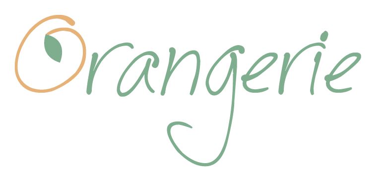
I feel as though I am finally getting somewhere now. I have simply adapted the 'O' on these examples and by changing them to orange and adding a small leaf, the type speaks for itself.


Using this idea I have applied it to a range of examples so that I can see which works the best.


I really like the idea of making the name itself more French and removing the English vocabulary, so instead branding my shop as 'L'Orangerie'. This is one way to overcome the type not looking French enough and expressing a decorative, delicate garden.
Below are a range of examples using uppercase and lowercase. I feel as though all of this development has finally allowed me to reach an idea which I am fully satisfied with and I am really looking forward to reaching a final logo design now.


CHOSEN LOGO DESIGN
This is my final logo I have decided on. I have taken the shape of the letter 'O' from one typeface and then used the other one to balance it out underneath. I love how the letter forms the shape of the orange, but doesn't meet as a full circle, allowing it to flow.
I am also pleased with the colour choice and think this works really well, if anything when I start to print it out on the desired stock choice I will be able to tell whether or not it is suitable.

No comments:
Post a Comment