Now that I have decided that I have chosen the Fedrigoni YCN brief to work on, I am in a position to start thinking of some ideas. Having researched into some existing calendars to try and get some inspiration, this has allowed me to start to think of some original ideas of my own. I have considered how I could possibly create a pocket sized calendar which could also be easily transported away from the desk to give it a second use, I've considered how it could represent a swatch booklet, however I am aware that this is something which has already been done several times before. I like the idea of the calendar being as interactive as possible, so that the recipient is able to feel the stock and understand the Woodstock range.

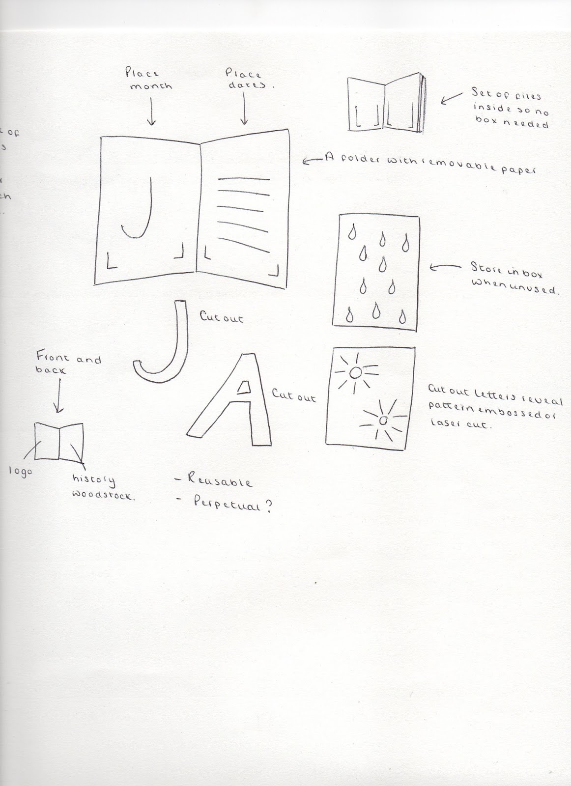
All of the ideas I have drawn out below are clearly annotated. I have had so many different thoughts about this project and now realise that I have to make a decision as to whether I should create a complicated calendar or whether it should be as straight forward as possible!


Taking influence from a calendar which I have seen, which illustrates each month in a different way, using different illustrations by laser cutting into the paper, I came up with the idea below. I am beginning to think that my ideas are starting to be too complicated however, and I don't want the recipient to find it hard to use as this would defeat the point of me designing it.
I feel as though I have drawn out most of the ideas that came to my mind to start with, and I am now interested in crafting some of these ideas to see how they would actually work. I am prepared for many of these ideas to not work work out the way I want them to, however this will allow me to eliminate the ones which aren't suitable, and focus on the designs which have potential.
Below, I have designed a very simplistic desk calendar. All of the months would be found inside of the container and removed when needed each month. I quite like this idea as the calendar then folds down and forms a cover/flap for the paper to be protected. I don't feel as though it is exciting or adventurous enough though, and I am going to experiment further before I make any final decisions.


Taking the idea of an advent calendar and the way in which a door is opened each day to reveal the gift inside, I created a simple mock up of how this could work with my calendar. I quite like the idea of revealing the information either daily or monthly, and the rest of the time, the paper is a mystery. On the other hand though, this isn't exactly celebrating the Woodstock paper range and instead it is hiding them away.


I went back to one of my initial ideas and decided to elaborate on it slightly. So that the paper isn't hidden, I decided to cut out a window to allow the audience to be able to view each month at a time. I like this idea, as the other months can be stored at the back once they have been used and it is quite a neat and compact solution, not taking up too much space on a desk.


I then tried a completely different idea out. I liked the idea of using something which has to be turned around in a full circle to gradually reach the end of the year. A decided to create a concertina which stands up by itself and has little pockets all of the way round for each of the different months. This would allow the audience to pull each month out separately and keep them all stored in the one place.
However, once I had made this prototype, I actually found that it was too fiddly and not sturdy enough. I also didn't like the overall aesthetic of it and thought it may take up too much room in terms of height once all of the months were added to each panel.


Taking the idea of creating a calendar influenced by jenga, I decided to have a go at constructing the calendar demonstrated below. Although at the moment this calendar doesn't have any dates on it, I can already tell that this wouldn't be appropriate to answer the brief. One good thing about this design however, is the fact that is folds down to become flat, and so this would be ideal to store when not in use. Although the whole point about having a desk calendar promoting Woodstock is so that it is on show at all times.


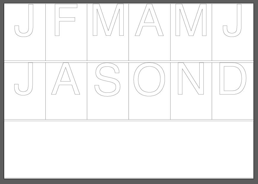
I then experimented using a concertina format, as I think this is one way of creating a successful, free standing calendar, if it is sturdy enough to stand up. By typing out all of the relevant first letters of each month and then removing the top half just to leave a pocket space, I decided to create a calendar which is quite intricately constructed. I wasn't sure whether this would work or not, and it took a lot of time to construct, however once I had cut it all out and experimented with placing some of the pieces of paper inside each month, it worked surprisingly well. The one problem I have with this idea is the fact that it is so fragile and is likely to break after a certain period of time. I don't think this is therefore the most practical idea or solution to the brief.


I then had a play around with the letter in the centre, outlined, to indicate where it would be cut away. I think I like the idea of the letters being slightly smaller and more subtle, but as soon as I look at this I notice how it spells out the word 'JASON' and I think this could be a slight problem. I think I will have to see if anyone else notices this when I take the work to the next crit.

I experimented with this idea and created tabs for the inserts of each month so that it is clear to the audience the month that they are about to reveal. I am quite happy with this outcome and feel as though I am finally starting to make progress in the right direction. This idea still needs a lot of refining but I am beginning to realise how it could potentially work.

As I was pleased with the outcome of the initial prototype for this calendar design, I decided to take it a step further and consider stock choice. Although at the moment I do not have a range of paper which resembles the Woodstock range, I thought I could at least get a feel for what the calendar would look like if produced with a variety of different paper.
One thing that stood out to me when I did this, is the fact that certain letters, such as the letter 'A' have parts missing. This means that the ink on the paper inside has to finish off the design, and doesn't allow the paper to talk for itself on the outside. I am still completely unsure as to whether or not I should be using the letters though, as I think there is a stronger alternative that I am yet to discover/hope to discover.

I decided to set up a small space in my room and take some photographs ready to take with me to the next crit of this work. I am aware that these photographs aren't the best quality, but it is just to indicate and illustrate the functionality of the design.

Once each month has been removed, it can then either be placed back inside of the main container, or it can be kept out on show, depending on the preferred choice of the recipient. This gives options and allows the user to do as they wish.


It is even clearer here that the letters on the reverse are even harder to decipher, and the blank spaces in the centre unfortnately causes the calendar to lose some impact.


This photograph is just to indicate how compact and handy it is in terms of size. A desk calendar should never take up too much room, and this design certainly doesn't.

I then tried to take some photographs with the calendar in context. This helps to show how big/small the calendar actually is and how little room it takes up in a working environment.


No comments:
Post a Comment