
1. It is compulsory to learn the anatomy of type. This is because we need to know how a typeface is formed to be able to create our own, otherwise we will make an inconsistent typeface which is unsuccessful.
The typeface anatomy is as follows:
Ascender
The ascender is the upward vertical stem on some lowercase letters, such as 'h' and 'b', that extends above the x-height in the ascender.
Aperture
The aperture is the partially enclosed, somewhat rounded negative space in some characters such as 'n', 'C', 'S', the lower part of 'e', or the upperpart of double storey 'a'.
Axis
The axis is an imaginary line drawn from top to bottom of a glyph bisecting the upper and lower strokes is the axis.
Baseline
The baseline is the imaginary line upon which the letters in a font appear to sit.
Bowl
The bowl is the curved part of the character that encloses the circular or curved parts (counter) of some letters such as 'd', 'b'. 'o', 'D' and 'B'.
Bracket
The bracket is a curved or wedge-like connection between the stem and the serif of some fonts. Not all serifs are bracketed serifs.
The rest are listed below:


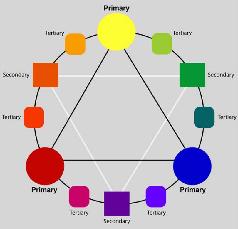
2. As graphic designers we need to be aware of the primary, secondary and tertiary colours. It is important that we are aware of them so that we can successfully apply them to our work when designing.
Primary colours
The primary colours are red, yellow and blue.
Secondary colours
The secondary colours are green, orange and violet.
Tertiary colours
The tertiary colours are yellow-orange, red-orange, red-purple, blue-purple, blue-green and yellow-green.

3. We need to have a clear understanding of additive colour.
Televisions, cameras, scanners and
computer monitors are based on the additive system of color (RGB), where red,
green and blue light projected together yield white.
Additive color systems start without light (black). Light sources of various wavelengths combine to make a color. In either type of system, three primary colors are combined to stimulate humans’ trichromatic color vision, sensed by the three types of cone cells in the eye, giving an apparently full range.

4. We need to have a clear understanding of subtractive colour.
Offset printing, digital
printing, paints, plastics, fabric and photographic prints are based on the
subtractive system of color (CMY/CMYK) in which cyan, magenta and yellow mix to
form black (K).
A subtractive color model explains the mixing of paints, dyes, inks, and natural colorants to create a full range of colors, each caused by subtracting (that is, absorbing) some wavelengths of light and reflecting the others. The color that a surface displays depends on which colors of the electromagnetic spectrum are reflected by it and therefore made visible.
Subtractive color systems start with light, presumably white light. Colored inks, paints, or filters between the viewer and the light source or reflective surface subtract wavelengths from the light, giving it color. If the incident light is other than white, our visual mechanisms are able to compensate well, but not perfectly, often giving a flawed impression of the "true" color of the surface.

5. We need to be aware of what chromatic value is and how it affects how we speak about our work and understand it most of all.
Chromatic Value: When we describe a color as
"light" or "dark", we are discussing its chromatic value or "brightness". This
property of color tells us how light or dark a color is based on how close it is
to white. For instance, canary yellow would be considered lighter than navy blue
which in turn is lighter than black. Therefore, the value of canary yellow is
higher than navy blue and black.

When discussing chromatic value we are taking hue, tone and saturation into account, therefore assessing and observing the affect they have on each other.
6. We must understand how rods and cones affect our perception of colour.


Rods are more sensitive than the cones but they are not sensitive to colour, they perceive images as black, white and different shades of grey. More than one thousand times as sensitive, the rods respond better to blue but very little to red light.
Each cone contains one of three pigments sensitive to either RED GREEN or BLUE.
Each pigment absorbs a particular wavelength of colour. There are short wavelength cones that absorb blue light, middle wavelength cones that absorb green light, and long wavelength cones that absorb red light.
When we observe a colour that has a wavelength between that of the primary colours red, green and blue, combinations of the cones are stimulated. An example could be that yellow light stimulates cones that are sensitive to red and to green light. The result is that we can detect light of all colours in the visible spectrum.
People who suffer colour blindness have less numbers of particular cones than normal, so they get colours confused.
If we lose our eye sight, the body adapts and receives colour rays through the skin. It takes time for the body to adapt, but it has been shown that people who are blind, can differentiate between different colours.

7. Never use complementary colours together.
Complementaries are colours opposite to each other on the colour wheel and they should never be used directly next to each other as they are uneasy to look at. Whenever two colours are placed together it is interesting to observe, because no matter what, even if the complementary colour isn't there it will show through the partner colour as they can't exist without each other.


8. There are 12 points to 1 pica.
1 point = 1/72 inches = 25.4/72mm =
0.3527mm
12 points = 1 pica

9. We need to understand colour modes and be able to define them.
RGB-
Colours projected by light (screen based).
CMYK-
Cyan, magenta, yellow, key.
CYMK
also refers to physical colours (pigments, paints, inks).

10. Four different weights of font make up a typeface.
For example:

No comments:
Post a Comment