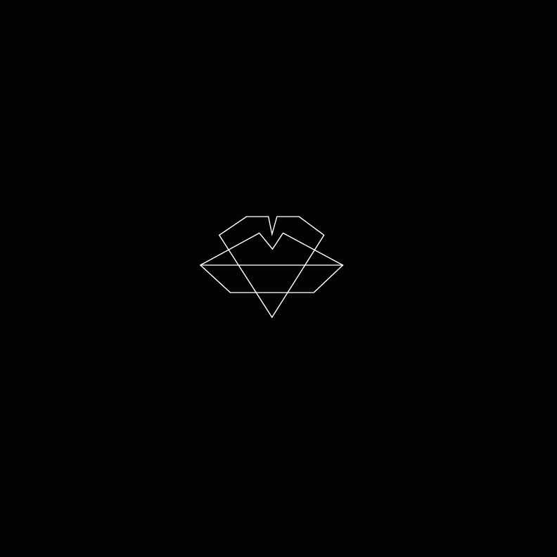
For this brief I thought it would be appropriate to develop the ideas I have drawn and experiment on Illustrator. I started off by drawing a heart and a pair of lips. I wanted to create them in a geometric format to represent Jessie Ware. I feel as though everything she wears is clean cut, sharp and smart and I have applied this to my design work. I also think the geometry links closely to all of the jewellery Jessie Ware wears.

Below I have shown how I designed the tuxedo on Illustrator. I used numerous rulers to align it and make it perfectly proportionate. Having not used Illustrator before to create work to fulfil any of my briefs I found it surprisingly easy to use. I used the pen tool as I thought it would be the most appropriate tool to use for this.

I then placed all three images next to each other to create a minimal design which could be used to represent Jessie in terms of design and personality. The heart represents love in the song, the tuxedo represents Jessie's fashion sense and the lips are appropriate as they link to love as well as resembling Jessie Ware as she always has bright red lips.

With the same design I inverted it to see what effect this would have and I much prefer it. The white on black works much more and stands out as being more eyecatching to the audience. I think perhaps the sizing of the images are inaccurate but I can alter than once I have decided the five designs I like the most.

I quite like how the heart and the lips work together to form another image. The point on the heart fits into the indent of the lips well and I think it would be quite striking, however may not be obvious enough to the customer what exactly the image is trying to convey and represent.
I drew out one of my designs on Illustrator as I think the lines create a unique and interesting pattern. I don't know whether it is too simplistic though and needs to have more to it to make it stand out. I will experiment further until I am happy with the design. The lines also closely reflect the idea that there are lots of crossed wires where love is concerned, and this brings confusion too.

I added the two other lines in to represent two more angles of the heart but I don't think it adds anything to the design other than making it appear more complicated. It also detracts from the heart in the centre, making it less of a focal point.

The tuxedo is a much more complex design if I apply the lines to it aswell. This is because there are many more angles to draw from. I do think that it creates an interesting pattern however, and with the stroke size smaller it doesn't take anything away from the object in the centre.

I thought I would try the tuxedo in the centre with the addition of the heart. I placed it on the right hand side and made it look as though it should represent a pocket or handkerchief. This is therefore a subtle yet appropriate design.

This is extremely minimal, perhaps too minimal. I have seen CD covers in the past which are as simplistic as this and they are successful. In this case however I feel as though I need to add a bit more to represent Jessie Ware.

I applied the same concept I have previously used for this design by incorporating the tuxedo. I don't think it works though because it looks too complicated and fussy. I wouldn't use this as one of my final 5 designs as it isn't strong enough.

Here I have enlarged the heart shape and placed the two other images on the inside of it. This almost implies that she is trapped in love as the things that represent her are on the inside. I tried it with a serese pink background and think this adds a successful and striking effect to it. I would consider using this colour for my final design.

This is the same design but will the addition of a microphone. I felt as though the previous design needed something else to complete it. I am not sure however whether or not the addition of this image is necessary here as it makes it look a bit too cluttered.

I tried to create another shape using the heart and the microphone but it doesn't really create anything outstanding. The heart looks too large and overpowering in comparison to the smaller microphone.

This is quite a quirky and feminine design. I think it really represents Jessie Ware but may not be clean cut enough. The use of hearts rather than music notes works well to make it a bit different from something you would normally expect.

I decided to adjust this design slightly by deleting a section of the microphone and applying the heart to replace it. I thought it might work quite well but I am not very happy with it. I think maybe if I deleted the bottom half of the heart to make it fit perfectly it would be more successful. However, this would defeat the object of the look I am going for, with lines and angles overlapping each other to represent confusion and crossed wires.

This is the same sort of design as one of my previous ideas. I have added the microphone in which makes it a bit more symmetrical. I find it is too normal and predictive though and think it needs something more to make it stand out from the rest.

I applied a cream background to the same design and inverted the lines back to black. I think this looks quite classy and sophisticated which most certainly resembles Jessie Ware.

I wanted to see whether I could create a cream and black pattern with the same drawings. I don't think it works with this design though. It would only work if it was a repetitive pattern.

This is an application of two ideas combined once again. I think it looks too busy and not powerful enough. The lines in the background are too complex too and take attention away from the main design.

I have used the lines from the tuxedo and kept them in the background of the heart design. I wanted to see whether the heart would work better enlarged and whether it needed added pattern in the background. I feel as though it doesn't need any adjustments made though as this looks too complicated.

Here I wanted to illustrate the happiness and sadness in love, by using a light, pure white against dark black. I like how the black heart is on a slight angle too, it makes it a bit more interesting to look at.

This is similar to the other design where I used the heart and the lips but here I have placed the heart so that it fits into the lips rather than them overlapping each other.

I created this by selected all of the different centre options on Illustrator. I thought the four hearts created a really interesting design which is complex enough to work alone in the centre.

This is the same design but rotated I think it works better this way. It somehow fills the page more and makes stands out more with the black background.

This is a minimal design with four hearts forming the shape of a flower almost. The baby pink background causes the image to look faded however, and I don't think it is the most appropriate colour to use.

It looks so much more professional with the black background. It could work well also if it wasn't centred. I don't this it is representative of Jessie Ware enough though and if I was to use it it would most certainly need many improvements making to it.

I think this is one of my preferred designs. Mainly because it fits well within the dimensions and stands out with the contrasting hearts. The lines indicate the confusion within love and they also tie the hollow heart with the whole heart making it even more intriguing to look at.

The idea of using the tuxedo to represent Jessie Ware would be quite successful in my opinion. I injected red into this design by altering the colour of the heart. I did this to make the heart a focal point and have the tuxedo as an added feature rather than it being the most important image of the design. I quite like how the red changes the way I view the design but at the same time I am not sure whether it maybe loses quality as the shade of red I have chosen isn't vibrant enough. I tried increasing the stroke size also but this made the heart blur together a bit more and not be as defined as it could be.

I really like the effect of this design. The lines aren't too busy but are detailed enough to create impact. In Jessie Ware's song she sounds as though she is confused about love and is in some ways cynical about it because of her experiences. I have illustrated this here by drawing lines on Illustrator to follow each edge of the heart and allowing them to cross over to show crossed wires.

Final 5 designs for the crit on Friday
These designs are the five I have chosen to take to the crit on Friday. I am going to print them out at the correct size so that the people in my group can get a true idea of what it would look like printed out. I am hoping for positive feedback but also critical feedback to allow me to improve or experiment further with my ideas before submitting the final one.