In our last studio session we were asked to identify 5 fonts with very different qualities. We now have to identify the full typeface family for each font. The ones I have found are blogged below.
Kozuka Gothic Pr6N EL

Kozuka Gothic Pr6N L

Kozuka Gothic Pr6N M

Kozuka Gothic Pr6N R

Kozuka Gothic Pr6N B

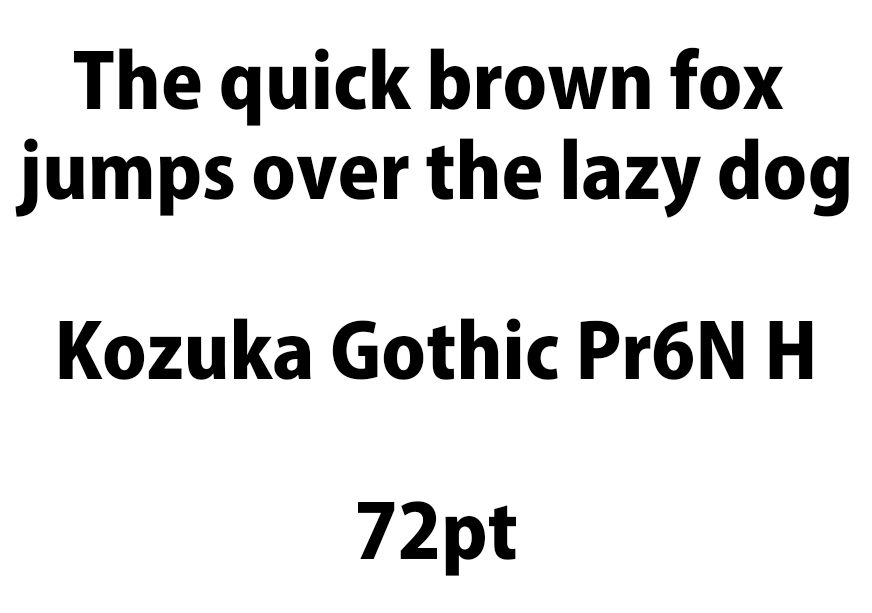
Kozuka Gothic Pr6N H

Palatino Linotype Regular

Palatino Linotype Italic

Palatino Linotype Bold

Palatino Linotype Bold Italic

Lucida Blackletter Regular

Mistral Regular

Imprint MT Shadow

We then had to experiment to find out which is the most readable of all of the typefaces...
Experimenting with type and point sizes 12, 32 and 72
Kozuka Gothic Pr6N Lowercase
12 pt


Kozuka Gothic Pr6N Uppercase


Kozuka Gothic is hard to read when it is at 12 point. It is slightly more readable when it is bold but I wouldn't choose to use this size for any of my work as it wouldn't be appropriate.
32 pt
Kozuka Gothic Pr6N Lowercase


Kozuka Gothic Pr6N Uppercase


At 32 point it is much more readable in 'M' and it works well for body text.
72 pt
Kozuka Gothic Pr6N Lowercase


Kozuka Gothic Pr6N Uppercase


At 72 point this font is very readable in 'M'.
Most readable
Most readable font for Kozuka Gothic Pr6N typeface

Most readable font for Palatino Linotype typeface

Most readable font for Lucida Blackletter

Most readable font for Mistral Regular

Most readable font for Imprint MT Shadow

We then had to choose 4 fonts...
- Block - Impact
- Script - Giddyup Std
- Roman - Times New Roman
- Gothic - News Gothic MT
With these fonts we had to cut up 'ABC' 10x10cm ready for the next session.
Impact


Giddyup Std


Times New Roman


News Gothic MT


No comments:
Post a Comment