
Below are my initial ideas and sketches for my mailshot.
I started by thinking of a double sided idea with the globe on the left highlighting the area Sharbat Gula is from and the area Steve McCurry is from. This would be to show inequality.

This idea is much more minimalistic and it could be argued that it may be too sparse. I think there is a difference between a design being simplistic and it looking rushed. In this case I think this design would look rushed and as though it had little thought behind it.

I then considered having one side with mainly image and a small amount of text with the majority of information on the reverse side.

My ideas then started to become a bit more technical and harder to produce. I thought about making the envelope out of the shape of Afghanistan. However this would not only be time consuming but it would also mean that I would be altering the dimensions of the envelope which goes against the brief.

I then considered keeping the envelope black and having the face as a focal image on the front.

Below I have designed my envelope and a possible from and back for my mailshot. I thought that I could have some text on the front saying 'where in the world are you?' to make it a bit more interesting to look at.

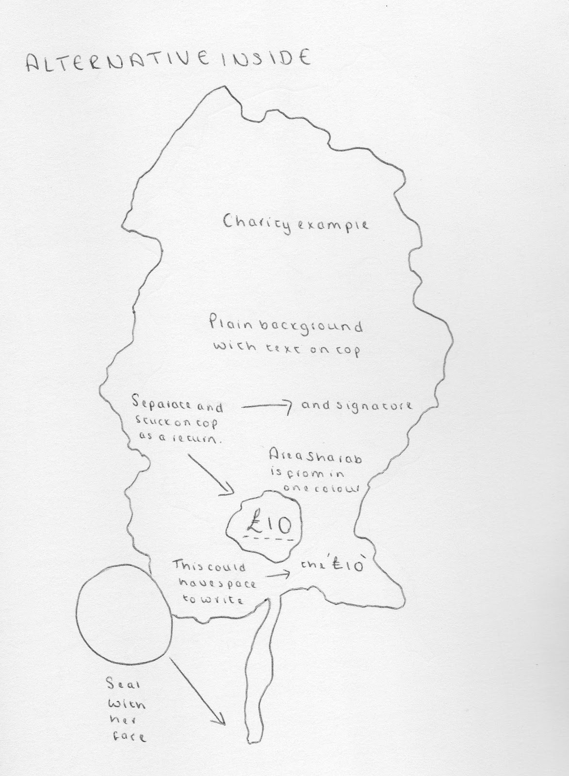
Here I started to strip the design to make it more simple. I thought about having some form of closure on the back. This would either be part of the print out or a separate sticker closure. I thought about illustrating the world inside the tear to show how Sharbat is recognised worldwide.

This design is a bit more intricate. I thought about having all of the different areas in Afghanistan labelled on the map with the address following the contour lines. The back would have Sharbat Gula's face on with the information.

This would take a lot more time and effort to produce and I'm not sure I could complete it to the highest standard possible in the time we have. I considered having a removable tab inside with a space for the recipient to write their amount and signature. As well as this, on the same design, I thought about having a sticker seal too.
I did another quick envelope design which is pretty self explanatory to look at.

Here I have taken inspiration from using a belly band. In this case however I would have it directly printed on the envelope because otherwise it may not be secure enough.

Here I have considered a more rounded edge to give a softer appearance. This may not actually be as effective though as I am trying to produce an envelope to represent a serious message.


This design is an envelope within an envelope. Inside the smaller one I would have an informative design in the shape of Afghanistan.

I did some mini closure sketches however I am unsure whether or not they are necessary as people often just tear an envelope open as quickly as possible which, in turn, would ruin the design.

Having completed a variety of sketches and ideas I have now started to develop them digitally.

The back would be plain with the shape of Afghanistan used as a seal.

Below I have designed a more rounded design, this would be one side of it.

I experimented with designing the reverse side however I am not too pleased with the outcome. The text is squared off and this doesn't work inside a rounded shape. I don't think it has enough impact.

Front

Back

Taking on board my issues with previous designs I have decided try out my designs in portrait format. It is not often that you receive a DL envelope in the post so I think this in itself would capture attention. I think the layout of this works really well however the use of uppercase for body text doesn't work at all.

Below I have experimented with lowercase lettering which is spaced out, this also looks really unprofessional. I am also unsure about the use of 'The Story' and don't think it is appropriate in this case.

I have changed 'The Story' to 'The Situation' and think it works a bit better but still doesn't sound very formal and professional.

Here I have reduced the amount of text I have included. I think it works much better a bit more spaced out and the heading 'Background' is much more appropriate. On all of these designs I have also added the scales to the bottom of the page. This was one of my illustrations taken from my initial poster designs.


This is my final design. I have boldened the body text to make it clearer and more legible.

Here is the front of my envelope. I have left space for the address and the words 'Amongst Afghan Women' needs to be moved to the left slightly.

This is just to show the process I took when I sorted my designs out for print.

Here is an idea for my envelope using red. I don't think it is necessary though as it almost takes attention away from the design on the front.

I much prefer the black design as the colour scheme is much more effective.

This is another adaptation.


This is my mailing list for affluent areas in the USA.

I printed a draft of both of my final designs to see what the quality was like.

I made a mock envelope and mailing list and I am really happy with the outcome.

I printed my designs in the studio. Bought white card and cartridge paper to try out both. The white card was too thick to feed through and therefore I was unable to use it. The image below shows how the cartridge paper printed.

Due to having difficulty printing successfully on the cartridge paper I decided I would just use the normal printer paper as it would prove too costly to try out more paper having already bought the right amount of stock to print on. Unfortunately the printer left marks such as the ones below. I therefore had to just keep printing until the quality was right.

Below are my final designs all ready for the crit tomorrow. I am really happy with the outcome and look forward to hearing feedback.

After having my feedback I feel very confident with my designs and I am extremely pleased with the outcome of my designs. I will feel content handing them in once I have made the necessary changes.
No comments:
Post a Comment