Having done lots of research on cake design it was time to put some ideas down on paper. Many of the ideas were quite complicated and as a result would be too time consuming to make. Within the time we have been allocated it wouldn't make sense for us to try and overcomplicate the cake.
I also completed a few more drawings which are shown below as further development.
So, as a team of three, Ellen, Harrison and I bought our ingredients in preparation the day before so we were ready to get started. The ideas which we favoured the most were the 'Leaning tower of type' and 'Alphabetti spaghetti'. However, we realised that when trying to make a cake lean it would become almost impossible for it to stay upright and be transported to college. So we decided against this idea. Alphabet spaghetti would have been really good fun to make, however the winners of last year's typogateaux had a very similar idea to this so it may not be the most suitable idea.
We decided to use the Hairy Nikers' recipe for a victoria sponge cake...
We gave it a go however and experimented with making a bowl to start with. The plan was for us to make a bowl which would be placed on an edible tray with the spaghetti inside it made out of yellow icing dipped into a pool of red icing and then leaving it to set.
The cake turned out really badly though because the oven wasn't powerful enough to bake the cake all the way through which meant that the inside of it was still the same texture as when we had originally put it in the oven. After two attempts we decided to have a rethink. Another idea we had had was to make a 'Helveticake' which is self explanatory. Ellen and I were unsure about whether it was original enough to start with but we were really happy with it once we had started to make it.
We added black colouring to our cake to make it slightly different and unique, when we were mixing it it had a strange grey texture to it and looked didn't look very much like a cake mixture! It was impossible for us to get it to be completely black though and when we put it in the oven it changed colour anyway. We considered covering the whole of the cake in black fondant icing if we felt it was necessary.
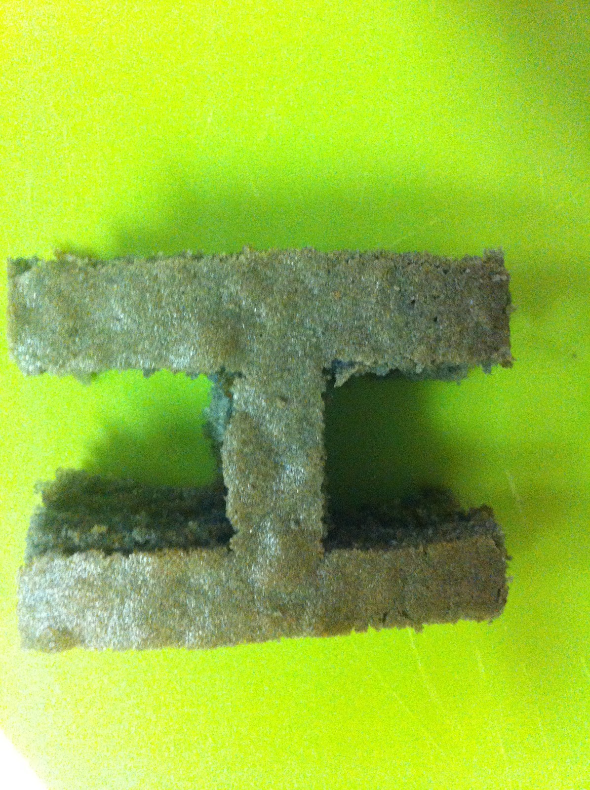
Here are a few photographs of us experimenting with a piece of the cake and using fondant icing to cover it. Using a rolling pin we gradually added more and more of the food colouring until the whole piece of fondant was covered.
We had to cut the icing into a net almost so that it would fit around the piece of cake properly with equal folds on each end.
This was the end result, and although it looks really good we decided that if we wanted to stand the letters upright it wouldn't work because the icing softened the overall texture of the cake making it impossible to keep it standing up.
We all had a taste of the cake at this point and although the icing improved the quality of the flavour we still didn't think it was worth it. Instead we decided that we would bake another cake the same size and spread a layer of jam between the two.
We spoke about the possibility of having added extras as little features to put alongside the cake, such as a ruler and scalpel but in the end felt it was an unnecessary addition.
We made our other cake and added jam to it before placing the other one on top and allowing them both to cool before starting to cut into them.
This is what our cake looked like before we started to carve into it to form our Helveticake.
Having found the correct point size and printing and cutting out each individual letter we were then ready to start the final stages of our cake making process.
It was difficult to get straight edges a lot of the time because the cake started to crumble away as it was fresh. However we were able to neaten the edges up afterwards. The inside of the cake once the letters were carved away looked really interesting as the two cakes had slightly different colours and the jam in the centre gave it a unique aesthetic quality.
As each letter was cut out we placed in on a chopping board for the time being. There was a layer which had formed on top of the cake which we removed, which is visible in the bottom right hand corner. This gave the cake an almost sponge like quality.
Originally, we wanted to put the cake on a green cutting mat. But in the end we decided against this idea mainly because the letters looked too big on it, but also because the word stands out much more on a white background. Overall we were really happy with the outcome of our cake and it proved to be a successful day as everyone had made some really amazing cakes with a lot of thought gone into each one.