For this brief we were asked to successfully tell a lie. In our group then, we therefore had to have a think of possible ideas and write them down before deciding on our final one.
Fake
brief – We had an idea which involved thinking of a brief to set
for the rest of the class and tell them that they had until Friday to
complete it on top of the work they already have set.
Fake
competition – This is the idea we settled on in the end as we
thought it would be the most effective.
Fake
guest speaker – We thought it would be good fun to tell the class
that there would be a guest speaker coming in on Friday before we
were presenting our work. This would encourage everyone to come in
and then you would all be disappointed when you find out the truth.
Fake
Christmas party – This is quite self explanatory however it
wouldn't have been as much fun when we tell the truth to you all.
Fake
foreign exchange student – This would have involved creating a
false account on Facebook and convincing everyone in the class to
bring a friend to uni.
Fake
fund raiser – This would have involved collecting money from
students in the university and they would be let down during this
presentation.

We decided on using the idea of a fake competition. I think this will be a lot of fun and the most interesting idea to develop. We all drew out our own design sheets with different ideas of varying layouts. We are going to include an illustration of a camera, the lomography logo and the headline 'FACEOFF'. I am quite happy with a selection of my designs and think that when we get together as a group it will become apparent as to which we all prefer the most.
The questions/elements of this brief we have to seriously consider and fulfil are...
- Who needs to know?
- What do they need to know?
- How will you tell them?

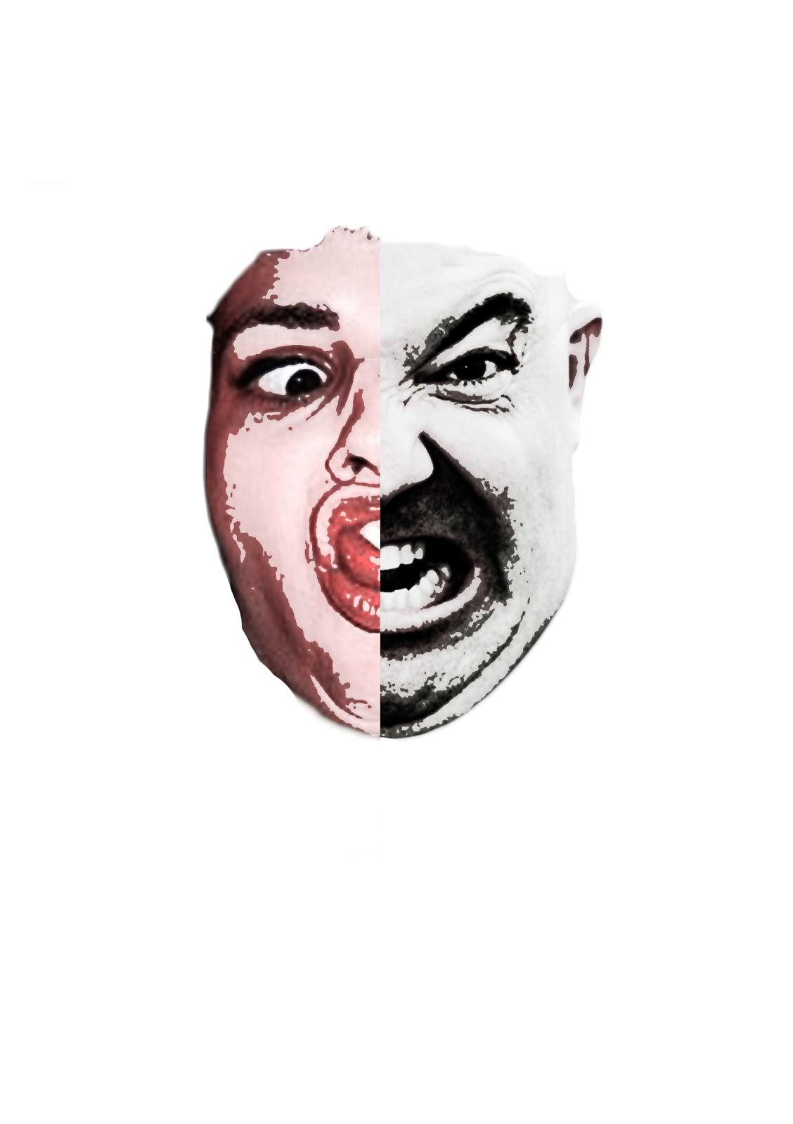
Below James merged the two faces together to illustrate deception and confusion. This image will be used on our posters and flyers.

This is the developmental work for the flyers. It is quite self explanatory and works well on the pink background. We chose to use a striking typeface which would stand out and I think it successfully captures attention.

This is the back of the flyer in progress. It still needs a few adjustments making but we wanted it to be concise and to the point, making it memorable to people.

This camera was designed by Harrison. I think the colours work really well together making it a very strong visual image. Hopefully it will be eye catching and encouraging.

Here the text has been applied to create a poster. I think the pink and blue really compliment each other too. I found it interesting watching the design process take place as I have never used InDesign before and I am not overly confident with using Illustrator.

This is the experimental process whereby James tried to see what it would look like combining both black and white type. I think it looks much more professional when it is all in the same colour.


This is a screenshot taken from our Tumblr site. The image is the first one we received from the librarian in uni. We are unsure whether someone else posted it on his behalf or whether he posted it himself. However after seeing this we decided that we needed to definitely add some smallprint to the blog to say that the competition isn't real and is just for work purposes.


I took a photograph of the location of our posters. This one has been pinned to a noticeboard not far from Graphic Design.

We put some of the flyers in the leaflet holders as well hoping that people would pick them up. We also placed them on the tables in the cafe and put posters in the toilets and in the lift.

We also asked Joe to get involved and post on Facebook to make more people aware and to encourage more people to send their photograph in to us. It actually had a positive effect as we did get some response from it.

Below are the Face Off flyers printed in black and white to start with so that we had an idea of size. We would never have distributed them like this as they wouldn't have captured anyone's attention.

Here are the final flyers, I think they look really professional and striking in colour.

Evaluation
- It was difficult to work in the studio as some people could see what we were working on
- When the photograph of the librarian had been sent to us we felt guilty because he probably thought he was going to win a camera so we added small print to the blog
- We obviously had to ask Joe to be our assistant otherwise the whole class would realise what we were doing
- When people asked what we were doing it was hard to lie effectively without giving anything away
- We managed to deceive some people which shows that we managed to effectively fulfil the brief, however if we had been given longer to advertise it we could have had more responses
No comments:
Post a Comment