Below are all of my spider diagrams which illustrate all of my initial ideas. I find it really useful getting all of my ideas down on paper before then developing them into sketches and visuals which will help with the digital development of my ideas.
At first I considered designing a variety of different materials, such as a telephone book, a pack of tissues, a recipe book, an empty photo album, as well as more to be contained in one box for the students to use. However after my crit it became clear to me how it would be unnecessary to create so many different things when I could just focus on one thing and make it as successful as I possibly can.

My ideas since the crit therefore reflect the idea of simply looking at recipes and focusing on the idea of how to make them functional as well as interactive. I have considered the way in which they could be stored, the way they could be used, and the other elements which could be designed along side them.

Below is a list of all of the elements I need to consider when designing my final product for the first year students. There are a lot of different things I would like to include, however not all of it is necessary, and I am sure that after crits and discussions I will be able the narrow it down to the most important.

This diagram is to illustrate the different ways in which my recipes cards could be stored. I thought about creating a board with cross over ribbons, inspired by research, whereby the recipes would sit behind the ribbon. However, I decided against this idea because I feel it is too feminine. I also considered using a magnetic board, but then it is a case of where to store the board when it is not in use without it being in the way of the other students you are living with. I thought about a clipboard, but once again it isn't very practical in terms of size and storage. I thought about a simple ring binder book which could possibly be stood up to use, or used flat against the work surface. There is always the option of a cork board, but it would probably get quite dirty and they aren't easy to clean. I think the most practical would be to use a ring binder as it would be easy to transfer from one room to another, easy to keep in a hand bag or rucksack and also easy to store in a bedroom out of the way.

When considering recipes, I thought about the importance of being able to supply recipes for everyone. Although this project isn't solely relying on the amount of recipes I supply, I would like to create a large enough range and hope that students are able to use at least one or possibly adapt them to suit their own taste.

Whilst carrying out my research I wrote down a variety of concept ideas which could be developed into drawings. I think it is important for me to explore as many different ways of presenting my work as possible, as I want it to look as professional as possible so that the first years can see what can be done after a year of being on the course.

Below are all of my illustrations of the ideas I came up with initially, when I was thinking of creating a 3 dimensional house to store all of the recipe cards in. The idea behind this originally was that each part of the house would contain a different item, relating back to the idea of having an address book, a telephone book and all of the other items. However, once I had got feedback on this idea, I realised that I didn't necessarily have to make it 3 dimensional, or make it look like a house, as this may actually make people feel more homesick and the whole point behind what I am doing is to make people feel less homesick while they are living in Leeds.

I also considered how it could be hung up or stored, but my ideas started to become a bit more feminine and not very suitable for both genders. I think because I want to create something so memorable and creative, it is hard not to concentrate on the design of the exterior and the container. The ideas that I have started off with have given me the motive to create something much more practical though, and I am pleased with the progress I am making.


With some of my designs I considered having different shaped containers for different objects, but again I think this may be a bit unnecessary. I explored the idea of stacking separate boxes on top of each other which could be stored on shelving, or possibly alongside each other too. All of these ideas still relate back to the house idea I originally created and could most certianly be adapted and developed when I make my final decisions.

These drawings indicate my changes. I have decided to concentrate on the design of the recipe cards, the way in which they will be stored, and the other products alongside such as empty shopping lists, stickers for tupperware, personal recipe cards, a recipe book and possibly an added element such as a tea towel or an apron.
During my crit with Simon, he sounded really enthusiastic about creating recipe cards which can be sent home for parents to fill in, which can be sent back to use. I have decided therefore to definitely include this, and I hope that it is an original and exciting way of interacting with the students and allowing them to feel involved with the product I am designing as I feel this is really important.
By looking at my research I have been able to design some recipe cards, taking inspiration from existing design. I have considered perforating recipe cards which can be torn off to send home, having recipe cards with an illustration on the back to indicate the type of food included in it, creating a folder for everything to sit inside in a pocket and creating stand up cards which are easy to read.
By looking at my research I have been able to design some recipe cards, taking inspiration from existing design. I have considered perforating recipe cards which can be torn off to send home, having recipe cards with an illustration on the back to indicate the type of food included in it, creating a folder for everything to sit inside in a pocket and creating stand up cards which are easy to read.

Here I have looked at the idea of creating a set of drawers which has one drawer full of recipe cards which are empty, and one full of recipes I have provided for the students. I also explored the layout of the recipe cards and how they could possibly work if I used a clipboard or other methods of storing them.

I feel as though my ideas are developing now and I am happy with all of the designs I have drawn out. It is just a case of settling on one design and concentrating on developing them digitally.

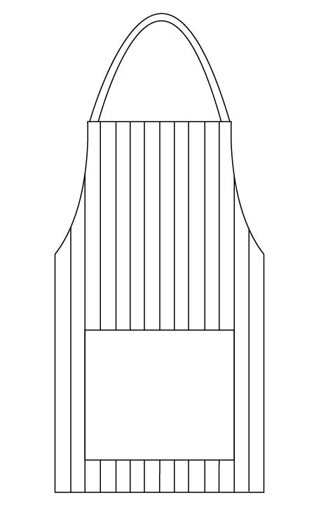
The idea I particularly like out of the drawings below is the one of an apron. I think if I could somehow include this into my design then it could work really well. I will experiment and develop my ideas further to see whether this could be possible.


I think the simple use of a ring binder to keep things together here is very practical and sensible, not complicated to use and would be easy to store.

Below is the net I created for my initial idea when I thought about designing a 3 dimensional house to store everything in. I designed it so that it could have boxes with open tops as well as closed boxes too.


Digital drawings
Having carried out lots of research I feel most inspired by the menu in The Botanist in Leeds. I feel as though I was instantly inspired to include illustrations within my work, so I have decided to choose recipes out of the student cookbook (on context blog) and illustrate all of the ingredients for them.
First of all I completed some digital drawings, or at least started to. I decided that they looked a bit too boring and lifeless, I think it is much more personal to hand render drawings anyway.

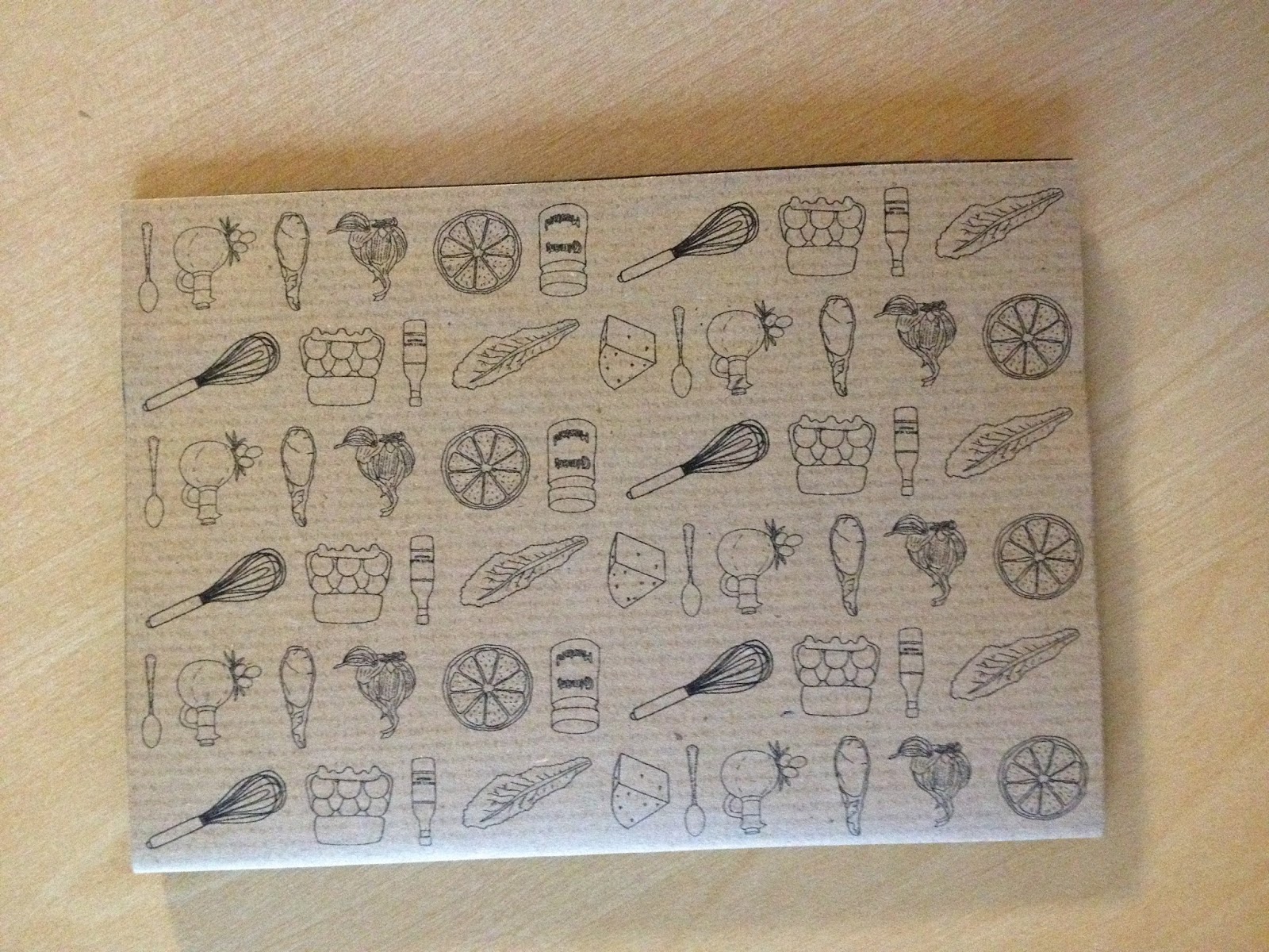
Below are all of the illustrations I have completed to illustrate each of the recipes, I am really pleased with the outcome of them and wanted to make them neat but at the same time give them an authentic, sketchy feel about them.


Pattern development
I decided to take a recipe and develop a pattern for it with all of the images. I think this will work really well for all of my recipes if I apply the same principle.


Application to designs
I first of all applied the pattern as a strip to the Caesar Salad recipe, but I think it looks a little bit bare. I tried using 2 different fonts as I want to try and develop my use of fonts rather than using the same one all of the time. Admiration Pains is the name of the header font, and although it ties in with my illustrations, I still feel as though it might be a bit too decorative and as a result hard to read. I am pleased with the body copy font which is called 小塚明朝 Pr6N.

I wanted to see what it would look like in navy blue, as I had it in mind to create a navy and cream design. However I will only know when I have printed it out onto cream stock.
.JPG)
I tried different layouts for my recipe cards so that I had a selection to choose from. I also applied a small illustration to the corner to give it a bit more of a personal touch to it. I like the dashed line and think it works well to separate the ingredients from the method. I will therefore definitely be using it on my final designs.


I tried the body copy text as header text but don't think this looks right either. I also think that the pattern would possibly look better if it was slightly cut off at the edges.


Below are a selection of photographs of all of the different layouts I designed, printed on a variety of stock. After having the crit and talking to a few other people, I have decided that my preferred choice of stock is the antique white. I also experimented with laminating as I wanted to see whether it would make the design look slightly cheap and not as professional, but I think it looks fine so I will be using this for my final designs.


I printed the blue ink against the cream stock here on a full A4 sheet, whilst at the same time considering whether I should develop this idea and make place mats which are laminated and therefore reusable. After thinking about it though, and asking students whether they would use them, it turned out that nobody would really use them in halls and so it would probably be a waste of money and time.


I designed a lot of them so that they could stand up on their own as I thought this might be a successful way of overcoming the binding situation. However, because the paper isn't that thick I am not sure whether they would hold upright without something reinforcing them.

Final recipe card layouts
Below are my final recipe card layouts. I downloaded a font off DaFont which is called Jellyka CuttyCupcakes and think it is perfect for my designs, as it is decorative enough but not too much that it detracts from my illustrations. I am really pleased with the layout I have chosen for each one, and have ensured that the pattern cuts off on each of the designs as I feel this works well. I have also included the illustrations on the right hand page of each one as the negative space didn't work very well and looked unfinished.


Apron bag container for everything
I wanted to create a container for all of the products to fit into. Whilst I was at home over the weekend I bought two tea towels to be included, one for each student. I therefore measured the width of the tea towel and the length of it, then added some more on to the measurements to ensure that the bag would be big enough.
Linking back to the idea of including the apron somehow in to my design, I decided to make the shape of my bag the shape of an apron. I designed and drew it all out on illustrator to start with.

I then drew on guides to ensure that the spacing of the lines was accurate. Then I removed them from the pocket as I felt as though it was unnecessary.

I then created a net for the bag...

I felt as though the pocket needed some text on it. So I chose to put 'My Kitchen' on the front of it as I feel as though it is the most appropriate choice of text to use, as they will essentially be creating their own kitchen with the food they buy and the recipes they create and use.

I also made a pocket to see whether it would be necessary or not, as I thought I could do with having somewhere a card that says what the bag contains.


This is the process I went through when sorting out the sizes of the bag on illustrator, using the rulers as a guide to ensure it was big enough.

This is what my mock up looks like on white paper. I am really pleased with it and think it is balanced, well structured, and the only one thing I will be changing is the handle, as it wouldn't be strong enough and I want to create a handle made out of string or ribbon.

Tupperware stickers
Below are the tupperware stickers with the colour matched up to my paper. I made them as simple and as functional as possible. At first I used the more decorative font but it didn't look right, so I used the same one I had used for my body copy.


I then created a belly band for my stickers to keep them all together. I created a pattern out of all of the illustrations I had created.

Shopping lists
For my shopping lists I created a narrow document so that they are a handy size to use. I then drew all of the guides in place before drawing the lines to write along.

Once I had perfected the design I then duplicated them until I had filled an A4 page and printed them out onto antique so that I could cut them out and put the band around them to keep them in place.
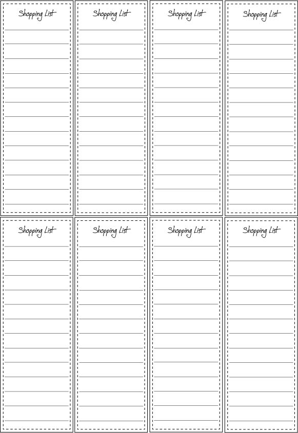
At first I used the dashed line but it looked too busy so I changed it to a simple solid line instead.


Originally I had created cards the same size as my recipe cards (postcard size) however I feel as though this would have been too big and it would have been unnecessary to have them double sided too.


Personal recipe cards
Below is the belly band for my personal recipe cards. I used the same pattern and applied it to a slightly larger belly band.

This is what my personal recipe cards look like, with space for a stamp, space for their parents or themselves to write the ingredients and space for the method to be written.

I first of all created this holder for them, but I feel as though it would get in the way, which is why I developed the belly band instead.


Outer card
Instead of having a pouch on the bag, I felt it would be more practical to have a little label which could be attached to the bag instead, which is why I developed the design below.

Belly band idea
Before I had decided on having the recipe book with a ring binder, I created this belly band to represent seafood. I thought I could create ones relevant for each food type if I had gone down this route. However it turns out that the belly band is much more practical.


No comments:
Post a Comment