What is your favourite colour?
Red
What is your earliest memory?
Being at the beach in Bournemouth
Which living designer do you most admire, and why?
Kate Moross, use of pattern and colour
What is your most treasured possession?
Brain/cameras
What would your super power be?
Teleportation (from anywhere to anywhere in a split second)
Which piece of graphic design do you wish you had created?
A piece of Mr Bingo's work or Si Scotts' typography
Who would play you in the film of your life?
Myself
Who would you invite to your dream dinner party?
Patsy from AB FAB
What makes you unhappy?
Arrogant people out in the city
What would be your fancy dress costume of choice?
Dr Frankenfurter (Rocky Horror)
Which words or phrases do you most overuse?
'you alright?'
'yeah, man'
'dude'
We were then given our brief...
To design a typeface for a full alphabet and glyphs that represent the personality/character of our partner.
Having read through the whole brief which was much longer than the above statement we then decided to continue to chat until the end of the session to make sure we had as much information as possible to work with.
Other facts about Kirsty are as follows:
- Most like to live in California
- Favourite animal is a monkey
- Knows herself and what she wants in life
- Unhealthy
- Misses her dogs whilst at uni
- Favourite bands/artists:
- Yeah yeah yeahs
- Beyonce
- Bat for lashes
- Outkast
- Daft Punk
- Star sign is Libra
- Agnostic
- Not a traditionalist
- Feminist
- Outgoing
- Opinionated
- Talkative
- Loves getting to know people
- Drinks lots of fresh juice/disaranno/beer depending on mood and situation


I have found several images relating to the answers Kirsty gave me and they are in my context of practice blog. While finding images I decided that I would start drawing from each image on top of a helvetica printout.
For the letter 'A' I have drawn strawberries and cherries as Kirsty loves fruit and both of these examples are red which is her favourite colour.
The letter 'B' represents Bournemouth, the stripes taken from the deck chairs on the beach and the geometric pattern in the second example has been formed from the outline of sandcastles.
The letter 'C' represents Kirsty's love for cameras. Instead of making it detailed I have decided to simplify my drawings to be very minimalistic, picking up on the shapes I could see within the camera.

The 'Q' represents teleportation in two different ways also, I prefer the lowercase in this example however as it is more effective.
For the letter 'R' I have concentrated on Kirsty's love for Patsy out of Absolutely Fabulous by illustrating the cigarette, alcohol and sunglasses.

I looked at Dr Frank n Furter for this example and chose two of the main, outstanding facial features which are the eyebrows and the lips. I felt that by simplifying the design I could start to develop my ideas to become more geometrical.

I then thought it may be interesting to look for shapes in other images I had found and decided to draw what I could find.
Below I have drawn the outline of the design on the front of one of the Daft Punk album's. I really like the geometric shapes within this pattern and think it ties in well with what I want to produce. The other images are self explanatory for why I chose them, but the cherry in particular has been chosen by me to represent fruit as well as the colour red.

Kirsty told me that her most treasured possession is her brain and her cameras so I thought I would try drawing both line drawings to see how they looked. Once again I drew the strawberry to represent the colour red as well as fruit. I also drew the outline of a disarrono bottle to represent one of her favourite drinks.

Her star sign is Libra which is why I have illustrated the scales to represent her balanced, practical views on life. The drawings below also represent the shapes from sandcastles in Bournemouth and the outline of California as she would most like to live there out of everywhere in the world.

The images below are a bit more generic and don't reflect Kirsty as closely. They represent her love for junk food, and I drew a basic surfboard to represent her love for California.

Having drawn all of the images out I then decided to scan them in to the computer and manipulate them on photoshop. Firstly, I experimented with the first pattern I drew and multiplied the layer to create a further pattern and filled some of the shapes with black to give the pattern a bit more added depth and power. I decided to use the most relevant images and the images which were more meaningful, rather than using junk food images.

Having drawn this shape I then decided to experiment to see what it would look like if I took the letter A and masked it to form a letter filled with a section of the design. The outcome is shown below. I really like the appearance of it but I think it could do with some more detail as the shape isn't formed as clearly as it could be.

Having taken on board my previous comment I thought it would be worthwhile to start experimenting with the other shapes and I tried to incorporate them in to my design to form an abstract image. I firstly experimented with the Disaronno bottle and added the illustration of the brain to the inside of it to make it appear a bit more interesting and also to tie two of her interests into one drawing. I really like the effect this has as it makes the bottle much more intriguing to look at. I then took the shapes of the sandcastle and multiplied them to form a pattern and following this I decided to add some swirly lines into the triangular shape to portray the sun loungers/deck chairs in Bournemouth.

I felt as though my image was really starting to work at this point and imported more images to create a much more intricate design. I added the monkey to represent her favourite animal, as well as the cherries. I didn't like however how symmetrical the design was looking which is why I decided to delete some of the pattern on the right hand side and added more of the same swirly pattern in again.

Below is a much more involved design, with a lot more going on within it. With the addition of the other images I think it stands out and becomes much more powerful and outstanding. I feel that this image successfully represents Kirsty's personality and it closely ties in with the designs of Kate Moross and her style of work.

Out of interest I thought I would invert this image to see what it looked like and it turns out I actually much prefer the effect this has. I feel that it is a stronger image with much more character.

Once again I came back to the typography and decided to mask the image again, simply choosing an area which I felt would look effective. I am a lot more satisfied with the outcome of this design and I feel that it is necessary to have the majority of the letter in black and the fine detail in white.


I went back to my original design before inverting it and thought I would add more detail in. I added the image of film as well as the camera outline and the outline of California. I think it works much better.

The final addition is the Libra scales on top of the image.

Now that I am completely satisfied with this illustration I have decided to revert it back to my preferred style and use this image to develop a typeface. So far I have experimented with Helvetica and I feel that it works really well so I am going to continue to use this for my final designs.

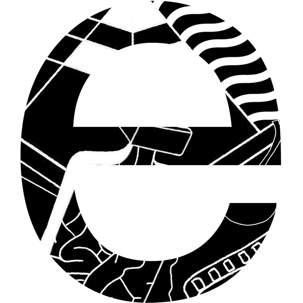
Below is my final alphabet. I have used the same technique of masking for each letter and I am really pleased with the outcome. I thought I might run out of pattern for each letter to look different but it turned out I had enough of a variety to make it work. Otherwise I would have had to rotate the image and grab different sections. I think that Helvetica works really well to portray Kirsty because it is a neat, simplistic font and I wanted to choose one like this because she is a very neat person and takes pride in her appearance. She also told me that when she works she is really messy and doodles everywhere so I thought it would be appropriate to keep this element of her contained within the letter to represent her inner thoughts and personality. The two characteristics seem to really complement each other in this design which is why I am happy with the outcome.


I then opened an A1 file on photoshop and placed the letterforms and glyphs where they needed to be. I did this by using the ruler to align the letters and make sure they were perfectly spaced.

As well as designing the alphabet and glyphs we were asked to produce a name badge for our partner.

I have experimented with putting my original illustration in the corner of this design but I feel it is unnecessary.

With Kirsty's favourite colour being red I thought I would experiment to see what it would look like to have a red background, however I am not as keen as I think it detracts attention from the black design.

This is a reverse of the previous idea but I think once again it is less effective and the text gets lost with the black background.

I have settled on my first design and have aligned it in photoshop so that it is ready to be printed at the right size (45x90mm).

I have developed a design for the back of my badge and I am hoping that it will work when it is printed, if it doesn't look right then I wont put a back on it.

Here are my final designs ready to be printed for me to make my badge. I am going to use white card and back the design on black card to make it more secure.

Having completed my designs I then had to try and get it printed out on A1 as it needs to be presented on A1 trace paper to present at our crit on Friday. It also needs to be hand rendered. I tried to get it printed out in A1 format but the printing facilities were unavailable. Therefore I had to print it out on two A2 sheets and stick them together. I then secured it on my cutting board to make sure I had a good surface to draw on, and I secured my tracing paper on top. The drawing process in total took 10 hours with a fine liner.


I am really pleased with the outcome of this work and feel that I have been able to test my illustrative skills. This has allowed me to successfully use my drawings to create this typeface. Although it was time consuming I feel that it was certainly worth it. I have developed my work even further by creating a lowercase version. Although it is still visually intriguing I much prefer the uppercase version. This confirmed to me that I had made the right decision initially in choosing the uppercase type to portray Kirsty.
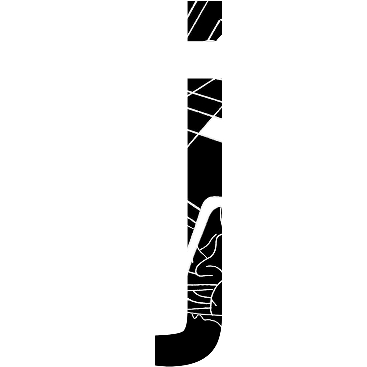
Lowercase


No comments:
Post a Comment