I found today's Illustrator induction really interesting. Having never used or been taught how to use the programme properly and efficiently, I found it really helpful.
We were shown how to sort all of the initial settings out to make sure they are ready for us to use the programme properly. The notes I took during this are as follows:
- Always name document
- Profile: print
- Artboards: paper area
- Picas: used for measuring type
- CMYK: ink/toner
- RGB: web images
- Raster effects: image made out of pixels
- Vector graphic: can increase a vector image and it be the same quality. It is a mathematical equation
- Producing image for screen - 72 pixels making up each inch
- Preview mode: default
- Malika Fauvre - artist reference

The curved line was also quite simple to complete as the instructions were easy to follow.


The further on through the exercises, the more challenging they got.


This final curve we were asked to create was the most time consuming. I think that once I have practised and got the hang of using illustrator, I will find it quite easy.

Once we had completed this exercise we were then asked to trace the letter g.
First of all we had to import the image to illustrator.

We were then told to create two layers, one of which we could work on and one which was the image we were tracing.

This was the raster image layer.

This was the vector image layer.

Using the skills we had just acquired, we used to the pen tool to start tracing over the letter.


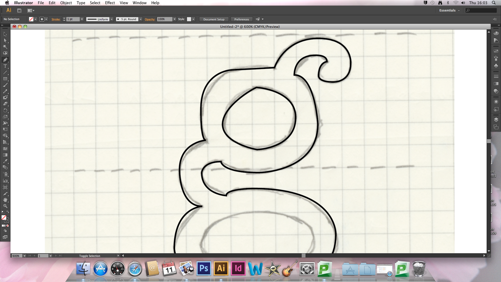

We were taught to use the convert anchor point tool to then perfect the letter until we were happy with it.

Here I have hidden the background layer to reveal the outline.

To convert the letter to become 3 different shapes we had to select the letter, go to object and compound path and this formed the 3 different shapes.
Another way of doing this is to go on pathfinder and 'minus front'.

Overall I found this illustrator session really helpful and I will definitely be working on it regularly to improve my skills.
Session 2:
Below illustrates how I used pathfinder to form the letter g quicker than using the pen tool.

We experimented with the width tool, as shown below.

Here I used a regular font on Illustrator and adapted it to customise it and make it my own. I did this by going to type, create layers and moved the anchor points.

I experimented with the blend tool to produce the two images below.


During alphabet soup I created letterforms which were all the same, using pop art style polka dots with popcorn emerging from each letter. Therefore for this illustrator brief I was able to recreate each letter in a very similar way. Having never used Illustrator before it took me longer than I would usually take when designing, I enjoyed it though as I was able to learn a lot along the way, especially when I had been shown the quickest way to get to the end result.

My first step was to create a 10x10cm square of polka dots. I did this using the rounded rectangle tool and repeated them once I had created a full row.

This is an example of how I created each letterform. I stretched the letter to fit the square at the biggest possible size.

I then made the letter into a shape by going to 'type' then 'create outlines' and then selected everything.

Once I had selected everything I was then able to go to 'object' and 'mask' and this formed the effect that I wanted. I repeated this for each of the letters to start with and then moved on to the next stage.

I opened the Photoshop file I had saved of my scanned in piece of work from our previous brief. I did this so that I was able to accurately recreate each letterform by using similar shapes of popcorn.

I started to trace using the pen tool and soon I was able to produce them at a quick pace.

I decided I would trace over more than a couple to give me more of a variety.

Now that I am happy with the amount of popcorn I have drawn on Illustrator I am ready to apply them to each letterform.

Above is my letter 'A' once I had added all of the popcorn to it. I am really happy with the outcome of it and have managed to recreate my letterforms to the standard I was hoping for. I will however use the pen tool to create the same triangular shapes I used in my original designs as this brings each letter to life a bit more.
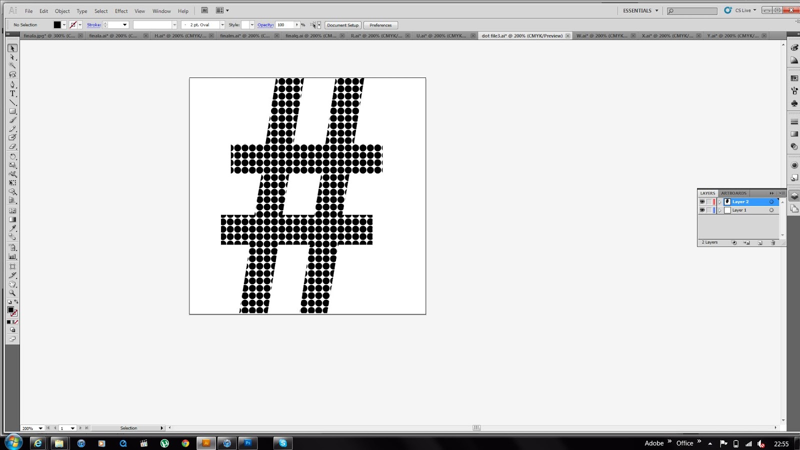
Having decided that I was going to grid my alphabet in the same way I had for my alphabet soup typeface I felt it would be beneficial to me if I experimented with glyphs to see how successfully my design could be applied to them. I used the '#' and think it works quite well as it is still recognisable and fits in well with the rest of the alphabet.

I then tried to see whether it would work with some popcorn included in the design and I feel that it almost ruins it and is unnecessary in this case for it to be used. The main thing is that people are able to recognise each glyph as belonging to the same typeface and I think it is still obvious in this case that they all work as a set. I feel that by having even more of a decorative element to the glyphs would ruin them and they would almost detract attention from the letterforms which need to stand out in order to communicate and portray a message successfully.

The brief stated that we were allowed to use CMYK and so I experimented with colour a bit to see whether I liked the outcome. I feel that in this case, the letterform loses quality when the shade of yellow is applied to the popcorn. My reason for this is because it stands out too much against the black and I find the two colours combined quite insipid and uncomplimentary. Yellow would be the only other suitable colour to use I think, otherwise the pieces of popcorn wouldn't look 'right' and they would lose value and meaning.

Just to make sure I was making the right decision when concerning colour I decided I would see what the popcorn looked like filled with black. I think it is much harder to actually tell that they are pieces of popcorn and I also think they could quite easily be mistaken for clouds. Therefore I have settled on simply creating the alphabet in black and white.

On completion of my alphabet I placed them all on to a grid to ensure they were all evenly spaced. I decided to use just the one colour as I think it looks much more professional. Aesthetically, I think that they are visually intriguing and they resemble the word 'pop' quite well. The choice of typeface along with the use of polka dots and pieces of popcorn combined seem to work really well in creating an almost 'explosive' alphabet, which is what I was aiming for.


No comments:
Post a Comment