Having had my final crit for my Fedrigoni calendar, I am now in a position to be able to design the final product to photograph and send to YCN. As I haven't been fortunate enough to use all of the Woodstock range to create my calendar, I have instead tried to collect a variety of different stock at different weights, to produce my calendar. Using the Fedrigoni website I have tried to use the tabs of colour that they have provided, and have tried to match the paper that I have as closely as possible.
When I created my prototypes using the cream stock to start and then the blue stock as the main cover, I recognised that the darker the colour is for the outer part, the more practical it is. If I was to use a pale colour for the main bulk of the design it could easily get dirty.
Below I have taken a photograph of all of the different stock I am going to be using. I am quite happy with the choice that I have to work with.

Below is my development for placing all of the information on the relevant pieces of paper. I decided that I would list all of the different weights on each month, and then highlight/make the font stand out in bold to illustrate the weight of the chosen paper used to create the calendar. I think the layout works quite well and it doesn't look like too much information has been crammed on one page. Due to there being 22 different types of paper in the Woodstock range, I was therefore left with 2 blank spaces once I had calculated that each tab was going to be double sided. So I therefore decided to write 'Happy New Year!' and Happy Holidays!' on the first and last month to give it an added personal touch!


I experimented with a selection of different typefaces when I was creating the final calendar as well, as I had simply used the first font as a sample. In the end I decided to use Myriad Pro Regular. I felt as though it was clear enough, legible and simple enough to use. I didn't want to over complicate the typeface as I wanted the main focus to be on the Fedrigoni logo.

I had taken this sample to the final crit, to get people's feedback on whether I should use the Fedrigoni outline of the crest instead of the letters to represent each month. I was really pleased with the feedback I was given as it was extremely constructive. There was only one person who said I should keep the text, whereas everyone else said that I should go with this idea.
I therefore decided to take the comments on board and develop my calendar further before submission. I am now at a stage in my development where I can afford to make these changes as they are only minor, yet they will have a huge impact on the final product.


Development of final calendar
Below I have photographed all of my development leading up to the final calendar design. Due to the last minute change of plan with the front only needing a small amount to be cut out, I decided that I would handcraft the whole calendar. Thankfully I was able to cut everything out accurately and I had enough paper in case anything went wrong along the way.
At this stage in my development I was really pleased with the outcome of the main bulk of the calendar, it was just a case of making sure that everything was folded accurately and that there was enough space for the paper inside to be handled.


When I was designing the cards for the inside, I came across a couple of problems. As I didn't want any of the text on the inside to be visible, I had to make sure that the text was moved up slightly, as shown in the image below.

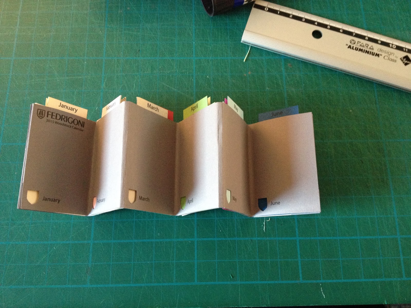
Folding the calendar was actually a lot easier than I had expected. It all went well on the prototypes, however I was feeling more anxious when constructing the final product.


Below is the centre piece, with the two pieces, front and back to be secured to it. As demonstrated here, I typed out the months alongside the cut outs to make it clear to the recipient. I also placed the Fedrigoni in the top left corner and then the contact details on the back.


Once I had glued it all together, I decided to cut out the first month 'January' to see how it looked. I was really pleased with the outcome at this stage and had no real difficulties so far.


This is what the final calendar looks like. I was so pleased to have finished it as it took quite a long time to handcraft!


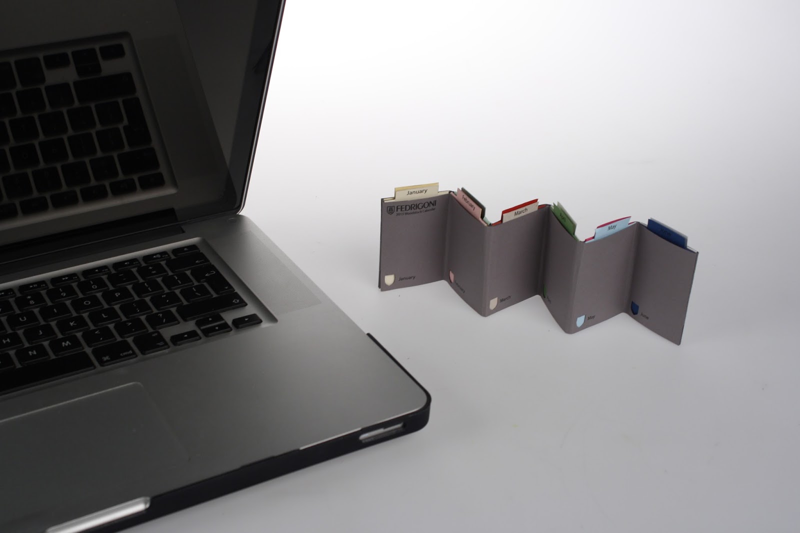
For my own personal use I just wanted to take a quick photograph to demonstrate development.


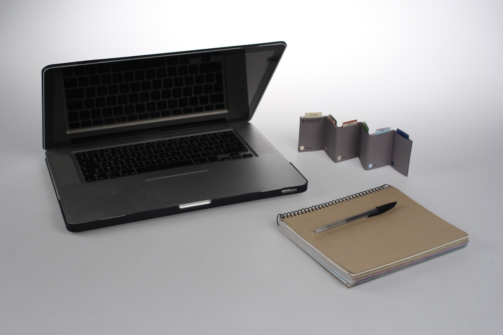
I then organised to photograph my work professionally in the photography studio, as this is something which had been mentioned to be in a crit before now, and I feel as though I am getting used to the equipment which is helpful. These are all of the different shots for me to choose from when it comes to be putting it all together on presentation boards for YCN.


Evaluation
Overall, I am extremely happy with the outcome of my desk calendar. It took me a long time to get to the final design, but this is one of the main things I enjoy about graphic design, as I can appreciate that the development it one of the most important processes to consider. Without all of the mistakes I made at the start of this brief, I wouldn't have been able to produce the end result as successfully. I feel as though this has also improved my crafting skills considerably, which is one thing I am always wanting to improve and an area which I'd love to grow in. I'm really excited to look at everyone's submissions and wait for the results!
No comments:
Post a Comment