

1. Additive Colour
2. Subtractive Colour
3. Colour Theory
4. Anatomy of Type
5. Point Size
6. Font or Typeface
7. Rods and Cones
8. Complementaries
9. Colour Modes
10. Grids
I have changed my 10 things to include slightly, to ensure that I include all of the most necessary points in my publication. I haven't however changed them on my '10 things' post because I wanted to show a wide array of possibilities I could have used.
Design sheets
I decided I would start my development process by completing some design sheets. I find that this always helps me to get my ideas in some sort of order and it helped me to see which I preferred. I did 12 designs for each page number on half of an A3 page so that they were clear enough for me to keep referring back to. Here I have experimented with the scale of the numbering on page 1, looked at how it could coincide with the symbol I am using, and thought about the grid system I am going to be using, experimenting with both postmodern and modern designs. I much prefer the modernism approach however because it is much more ordered and clean cut in comparison. Also, it is much more appropriate to take a modernist approach as this involves using grids all of the time.

For number 2 I did the exact same thing, in this case however I concentrated more on making it look ordered and neat. I really like the idea of having some sort of numbering system down the left hand side of the page, which would indicate which page number the reader is on, but in a subtle way. This could be achieved for example by blocking out all of the other numbers by illustrating a grid whereby only the number 2 would be visible. I also like the idea of merging some of the imagery in to the lines which are forming to make a grid. This would make each page balanced and would provide me with a consistent format to work with, without being concerned that the pages don't flow as a whole publication.

Digital version of preferred thumbnails for number 1 and 2

Many of my designs for page 3 are also quite complex, this could possibly be an issue if I was wanting to make a consistent publication. I experimented with combining the star shape which is formed within the primary, secondary and tertiary colour wheel, allowing this to become the main structure of the page. This worked well in some cases, however it may not be as recognisable on such a large scale in comparison to a smaller diagram on one of the pages. I am certain that I will be choosing the strongest designs from all of the page numbers and then deciding which one I prefer the most, then apply it to all of them.

I enjoyed experimenting with the number 4 as I was really able to explore the possibilities of using it as a tool to split the double page spread up in to different sections. I did this by combining the points and picas diagram in with the elongated line, which I felt worked really well. I also used the same principle but applied the diagram to the number vertically, this also worked really well. Some of the designs, for example when I created an almost mirrored design with the letter 'P' didn't work so well, as there was no real reason for applying this idea, other than it looking a bit more creative possibly. I much prefer design with reasoning behind, as it shows that thought has gone in to it and it hasn't just been rushed.

Digital version of preferred thumbnails for number 3 and 4

Number 5 was also a strong one to experiment with in terms of using the actual digit to form the layout of the pages. However sometimes I felt as though it was getting slightly lost in the design as it wasn't clear enough. I also wouldn't want the numbering to be the main feature of each page as the quality of the design would be lost I feel.

My previous point I made about the numbering detracting attention from the content is most definitely valuable here. Since designing pages for the number 6 it became apparent to me that not all digits are easy to work with in that way. Because it isn't very angular it made it harder for me to use it as a foundation for creating a layout. Another thing I did look at here was using the actual letterforms for the work 'SIX' and applying them to the design as a bit of a change. However, I don't think this would look consistent with every page as each number has a different amount of characters in it.

Digital version of preferred thumbnails for number 5 and 6

I found that I was able to create lots of interesting layouts with the number 7, as it is very angular and there were a lot of options for how it could be placed on the double page spread. It is not my favourite set of layouts however, and I feel as though none of them stand out as being a very strong design. I would like to maybe use the strongest design overall and apply it to each page throughout my publication, rather than making them different in accordance with the number used.

I found that 8 was also not as easy to work with. I experimented with it and found that I could form a grid by drawing a horizontal line through the centre of it. I found it worked quite well when I drew the vertical lines to represent the image of complementary colours. It seems as though the further I get through the numbers, the more challenging it becomes to produce layouts which would be suitable for all of the double page spreads. I therefore think the simpler the better so it is easily applicable.

Digital version of preferred thumbnails for number 7 and 8

I think because I have the different colour mode images to work with here, there are a lot of different ways I could compose the double page spread. I have therefore been able to experiment lots and I am quite pleased with the outcome of these designs. I think the '9' digit with a vertical line doesn't work as well as the one with a curved line, therefore I shall be using the '9' taken from the Kozuka typeface.

This was another one which worked well, I could even use the uppercase letterforms 'TEN' rather than the digits, however I don't think this would work for every digit once again. I think the most successful here, is when I have used a simple grid, for example the bottom right design where everything is boxed off in a certain area. I think it would be worthwhile trying to develop this idea and apply it to each of the pages as I feel as though it would be successful.

Digital version of preferred thumbnails for number 1 and 2

Development...
I then started to work digitally, and first of all used the Fibonacci sequence to create a custom sized page I could use. I am happy with the page size I have produced as it isn't too big and isn't too small, however I may decide at a later date in my design process to scale it down if my design requires a smaller page size. At the moment the page is 17.5cm x 26.5cm.


I then used Van De Graaf's canon to separate my page in two and possibly use the idea of inserting text and image in the boxes I have drawn. However I feel as though I would like to be a bit more experimental than this, as there are so many possibilities with this brief in terms of what grid we decide to use, therefore I think it would be interesting to create my own to some extent.

I firstly started to experiment with the layout of the cover design. I tried to incorporate the uppercase letterforms in to the design and used the letter 'I' to make an almost central separation to the page. In this case however I don't think it works very well and I won't be doing anything similar to this for my final design.

Here I did the same thing but in a slightly different way. I feel as though the black is too harsh for the weight of the letterforms. It also makes it hard to know where to place the rest of the text on the page, as it isn't exactly a balanced ratio of black to white.

Here, the lines work a bit better I think. I especially like how the horizontal line continues on to the back page, giving it some form of continuation rather than it coming to a sudden stop on the front and having a black reverse side.

This was slightly easier to construct in terms of deciding where the rest of the text should be situated on the page. However I am not happy with the overall composition of the page and feel as though it isn't quite there yet.

By simply reducing the stroke size of the line and moving it to be placed in between the text rather than merging in to it, I feel as though a completely different image is made. It is definitely more legible and balanced and would be more applicable to a publication cover than any of the previous designs.

This below doesn't work well as it just looks as though the 'I' has been elongated for the sake of it, not really providing a strong separation to work with on the page.

I quite like this design as it is balanced and I have experimented with the weighting of the typeface I have used (Kozuka). I'm slightly unsure about whether the word 'things' works on it's side though, and think it could possibly annoy the reader, as everything else is lined up perfectly, being read in the same direction.

I tried to see whether it would be possible to create a block of text consisting of the title. I don't think this typeface is suitable for this, but I also think it instantly looks too crowded, and even when I have seen it done before I have never been overly fond of it.

Below is the information I typed in to create my new document. I decided that I would reduce the margins slightly from the preset figures and change the orientation to landscape, to allow me to separate each page in two accordingly, to create my double page spread.

Below is one of the designs I started with, taking the idea of the addition symbol to represent additive colour. I feel as though it is important to use associative imagery to allow the information to become as memorable as possible. I also used RGB swatches to represent screen based design. I tried to incorporate 'RGB' to the inside of the addition symbol, but don't think it is very effective. The number 1 here is very subtle, especially in comparison to some of my initial drawings.

This is what I came up with once all of the guide lines were taken away and the addition symbol had been altered slightly. Instantly I prefer it and I love how the symbol fits perfectly to follow the vertical and horizontal lines I have drawn on.

I wanted to see what my layout would look like if I was to have an oversized image on the left hand side with text alone on the right. I quite like it, but feel as though the 'RGB' surrounding the symbol doesn't work as well, as it doesn't look balanced. It would work better with 'CMYK' as there are enough characters to place around it.

I much prefer this. It just shows that the additional text of 'RGB' isn't really necessary. I don't think the positioning of the text works well now however, as it needs to coincide with the positioning of the imagery.

I didn't know whether the central vertical line was necessary, as it is quite obviously the centre of the page. I like it both ways but thing it depends on the composition I want to create for each double page spread, and whether I want the centre to be a noticeable feature to highlight the grid system I have used.

Here I have experimented with moving the symbol down so that it falls off the edge of the page and overlaps the margins, I have also moved the text to make room for more imagery going down the centre of the page, which I thought could be the colour swatches once again.

By simply adding another horizontal line to the bottom of the page I have created a more balanced page instantly. I think i will follow this sort of structure for my final design as I love how it separates all of the text and imagery in an ordered way.

Here are the measurements of the margins below, to indicate the consistent grid I will be using throughout my work. I decided I didn't want it to be symmetrical so I made the top and bottom slightly unequal.

I wanted to see what the same design would look like without the addition symbol being filled with block colour. I think this makes the design look much weaker and more subtle, and I'm not sure whether this is the effect I am wanting to create.

Without the lines going through the centre of the symbol it looks much better, but I am still unsure as to whether or not it is strong enough visually to capture people's attention.

Here I have simply reduced the size of the symbol slightly and moved the text in to allow room for enlarged colour swatches. I quite like this layout but feel as though there is something missing.

Finally I am becoming much happier with this design. I am glad I have been able to explore and experiment so much with this one layout design as it will allow me to settle on one and apply it to all of the other pages.

I think the addition symbol filled with black works much better and makes it look much more balanced, however I still think that the colours on the right hand side could do with changing slightly.
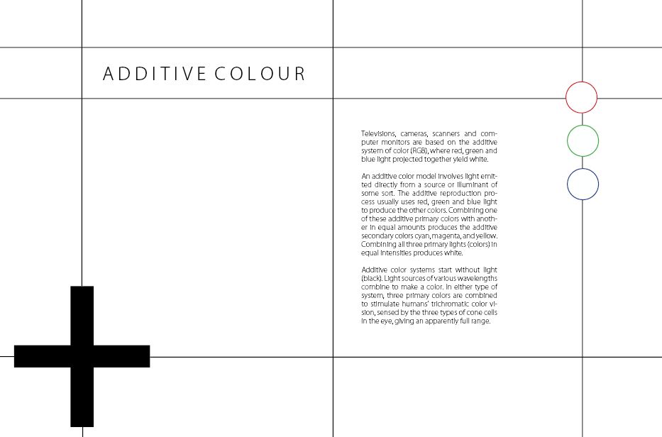
Here I increased the stroke size of all of the images to make it all stand out a lot more. I think it definitely worked to create a stronger composition overall.

By removing some of the lines I was able to see whether or not they were necessary, in this case the singular line alone doesn't work at all, and it need something else to make it look a bit more balanced and appealing.
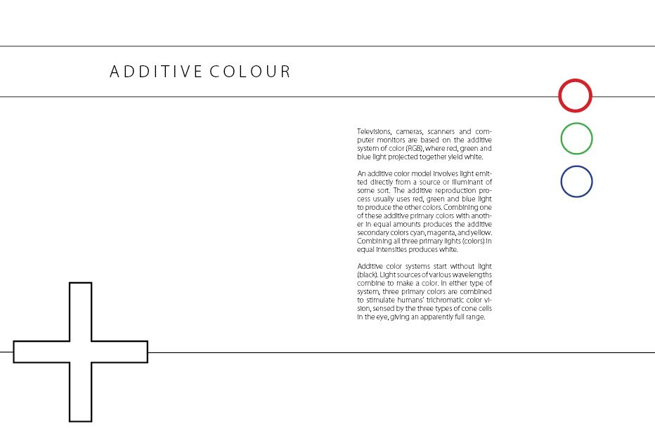
The overlap of the colour swatches reminds me of the olympics, but I wanted to try and illustrate how they are all mixed together. I don't think it is necessary after trying this though, as the addition symbol works in replacement of this idea.

This instantly looks better now that the stroke size has been increased even more. I am a lot happier with the progress I am making, and although the changes are only small they create such a difference on each design.

Below is one of my ideas for numbering pages enlarged. I thought the simple idea of highlighting one circle would indicate the page number in a very modernist way.

Moving on to subtractive colour, I experimented with numbering down the left hand side. I created outlines on the numbers to allow me to highlight to specific numbers.

I then applied it to one of the additive colour page layouts. I like it but along the way I have been printing some pages off to see what it looks like when printed and the effect isn't quite as strong.

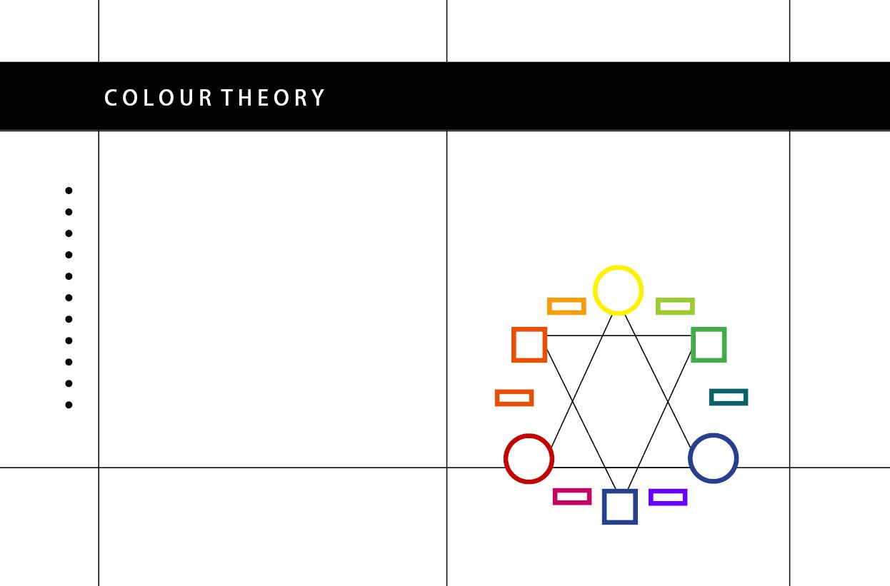
I started another page too, illustrating the colour theory on the right hand side whilst blending the line in with the design. I also used circles along the side to see what they would look like and I just find them quite unnecessary and not exactly serving a purpose.
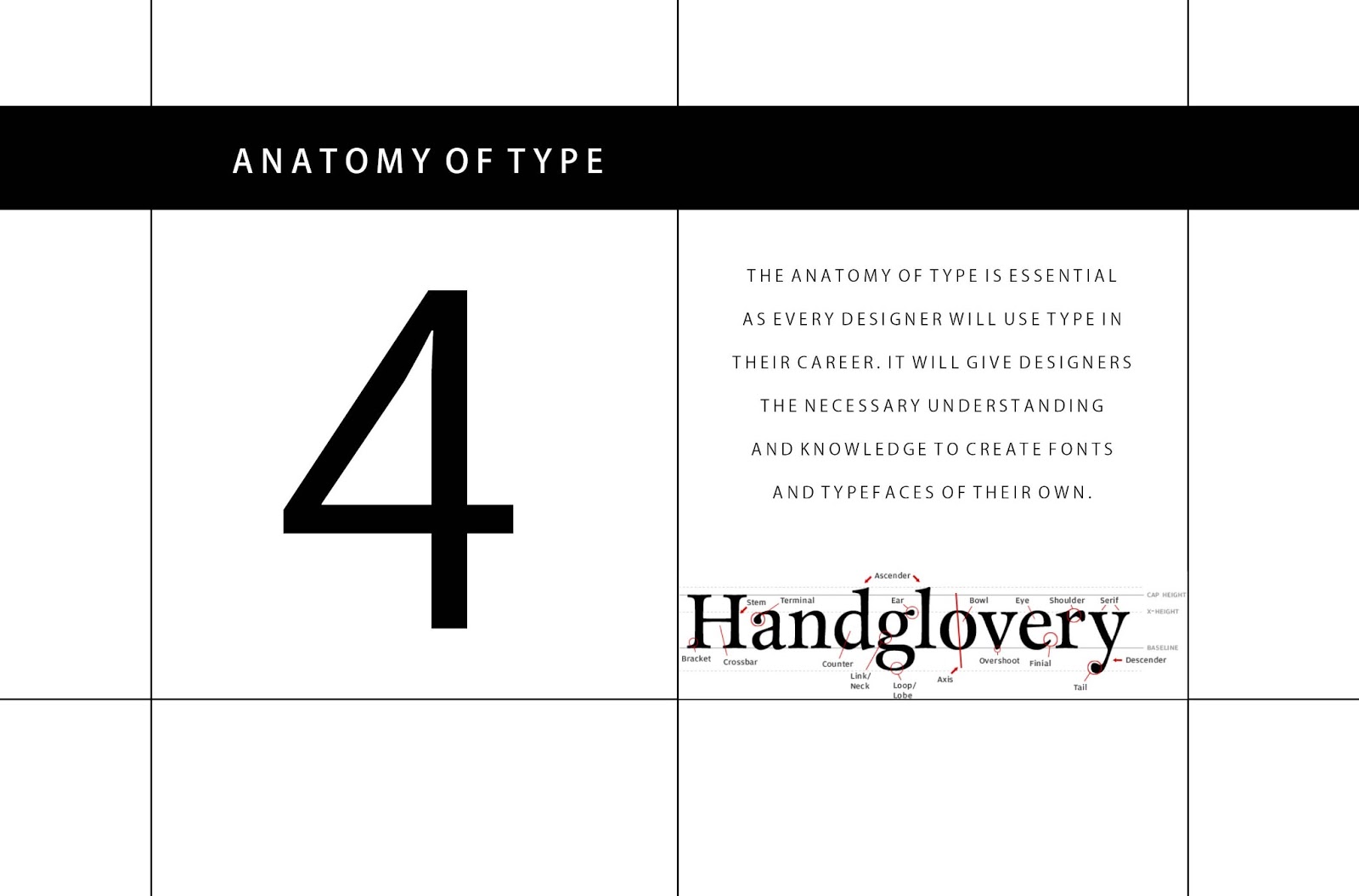
Below I have shown the grid system I used when drawing the points and picas line. I wanted them to be perfectly drawn so that the lengths were all equal and accurate.

Below I drew Van De Graaf's canon to include on my pages relating to grids.

Now that I am happy with the layouts I have produced and think I am going to apply the same, well structured grid to each of the pages, I am going to design each of the individual pages, firstly without taking the binding into consideration, just so that I can make sure that they work as double page spreads. Then I will consider the method of binding and move all of the information around so that when printed they are all in the correct place.
I used scrap pieces of paper to produce a prototype so that I knew where everything should be positioned roughly, and with the way I want it to look it makes sense to have a contents as there is the room for it.
Below is the new document I set up, this time with 12 pages so that I have room for the contents page as well as all of the other 10 page spreads.

I went for a much more simplistic and bold approach to the cover. I didn't want the cover to be too overpowering, but just professional enough to capture attention and look smart and concise. I experimented with the length of the black rectangular shape as well as the weights of the typeface. This in itself was enough to create impact and even worked well once printed which is the most important thing to check.


I decided to enlarge the numbers on the left hand side to make each page consistent and practical. This made it a lot easier to decide where everything should be placed on each page. I am really happy with the outcome of all of the double page spreads I have created and look forward to actually having it printed and bound.




Once all of the design work was complete I decided that I would print all of the pages out, cut them in half and stick them appropriately to coincide with where everything needs to be placed within my publication. This then helped me to work digitally once again and move the content around so that it was all in the right place.

Using the print outs as a template I was then able to create the following double page spreads which are almost ready to be printed. After a long process of designing and experimenting I am finally happy with the outcome.


Below is what the same publication looks like, but without the lines in place. I have saved this document separate to the other one as I want to have it in case I decide to have a piece of tracing paper in between each page with the grid printed on it, to give it added aesthetic value and make it a bit different. I have experimented with this and it is photographed below this set of imagery.


Binding and experimentation
When creating this publication I was constantly printing throughout the design process to ensure I was happy with the outcome, because often what you see on screen can look much better than when it is printed.
Below is the second prototype I created once I had experimented with scrap paper. I found this really helpful in terms of informing myself where everything should be placed.

Below is the same prototype printed alongside a smaller print out of one of my pages along the way. I reduced the size and halved it to save my ink, but I actually quite like the size of it, as my publication has a lot of white space in it so it can afford to be that little bit smaller. I may consider this when it comes to printing.
Paper sample 1

I printed one of my pages out on to brown paper, feeding it through my printer at home. Having just bought a new one, the quality of the print is amazing and I thought it would be worthwhile experimenting with any stock I already have, to see whether it is able to feed through before buying stock of relevant colour to me. The brown paper is quite thin and wouldn't work for this type of publication.

This is actually a piece of pale green card, and although I wouldn't be using this colour for my final designs, I am happy with the outcome and I am now aware that I am able to feed card through my printer too.
Although I have a print slot booked in to print this publication off, I think I will try and produce one whilst I am still at home as it will be completed then and ready for submission. As the quality of my printer is strong enough I think it would be worthwhile to do it this way.

I took a photograph of some trace I printed on at A4 scale, but to the correct size of my publication. I just wanted to show how the paper can curl up at this scale.

Here I have made a smaller prototype so that I could grow in confidence with how I am going to bind my publication. I really like this way of binding, as I like how all of the edges are visible. I also found that when I was playing around with the paper, it is almost impossible to do perfect binding whereby the edge of the pages lines up perfectly. I think this way of binding is most suited to my design and it was simple enough to do. I am going to experiment with different stock and different threads and ribbons before deciding on the final materials I want to use.


Here I have experimented with printing on a piece of trace, which surprisingly worked very accurately. I made a small mock up of what it would look like, with the lines removed from my double page spreads, allowing the trace to become an added and important feature to my publication. I once again tried it on a smaller piece but actually think that it worked really well.
The way in which I have bound it here, is by simply putting one stitch through to keep it all in place. Despite there only being one stitch it kept it where it needed to be and the tracing paper stayed where it needed to be.
I feel as though if I was to print to the scale which I originally decided, it may mean that the trace would get damaged, as it would be more delicate and prone to folding over or curling up. Having never bound a book before or had any experience with it, I think it makes more sense for me to go with what I think would look most successful by the end of it.


I have looked at saddlestitch, which would certainly work in this way. However I purposely designed my pages, composed in a certain way to be able to stitch through the paper in the same way shown with my paper sample 2.

Here, I accidentally printed a couple of pages out on to tracing paper, the top one printed off fine, however the first page didn't work as the ink started to run. This is interesting to note as it could possibly happen when I print the grids on to trace, however I am hoping that because there is only a small amount of ink needed, this won't happen.


