Thursday, 29 November 2012

OUGD405 - Design Process: Design Boards

These self-deception design boards portray the research I have carried out to represent 'self-deception'. I found it quite challenging to use my research to produce the finished outcomes but feel that I have managed to find a sufficient amount and will be able to revisit it again if necessary once we have been given the brief.
 
For my primary research I looked at plastic surgery to find out more information. This is because I feel that it was most appropriate for a question to be asked about this rather than on anorexia or bulimia or other forms of self-deception which may be a bit too personal and make people feel uncomfortable to talk about. Although it could be argued that plastic surgery and cosmetic surgery is also a touchy subject, it is slightly more lighthearted when we consider the 'lizard man' who changed his appearance to resemble an animal. I think this is quite intriguing and a little less dark and morbib than other subjects.
 
I asked students from my course as well as family, flatmates and the general public what they thought about plastic surgery to see whether they would have it or not. I had a lot of mixed responses and I think overall, the general opinion is only if it was needed for medical reasons or as people get older. On the other hand there were some people who said they would have it to make themselves feel more confident. This could be seen as self-deceiving as they are making themselves believe that in their current state they are not 'good enough' or attractive enough and therefore want to spend money on surgery.
 
I have also found imagery to portray the need for cosmetic surgery, these images are of myself and my boyfriend undergoing dental cosmetic treatment and nose surgery.


For my secondary research I found a lot of images and videos along with facts from the NHS website. I looked at four particular examples of self-deception and still feel that the plastic and cosmetic surgery is the most eye catching and almost appealing to look at as it draws attention to the unique individuals wanting to become animals. I personally found this the most interesting area to look at too which is important.


This is my directional board demonstrating four different routes I could go down. I have shown case studies of 5 different individuals with completely different reasons for having plastic surgery. For health reasons, having no choice, vanity purposes and wanting to dehumanise themselves.


OUGD405 - Adobe Photoshop Workshop

The basics of Photoshop


  • Learning how to use Photoshop in the most economical and efficient way

At the start of the session we spoke about the most appropriate way to brighten the mosaic. 


We were then told how to set up a document to be appropriate for our work.

We were told to never increase the scale of work created, therefore we have to have in mind what the size of the document needs to be for the end result. 

We have to constantly relate back to the output. 

We will always be made aware of the size because no matter what we will always have a brief stating what the output is.


There are 300 pixels making up an inch.

When you print large scale everything is split into sections known as sheets.

A billboard is 48 sheets and therefore we would use a higher resolution.


The screen only has 72 pixels making up each inch. 

There are now different resolutions for screen and screens are now actually 96 pixels per inch.

This hasn't been changed because Graphic Designers don't like change.

Ultimately working in the industry you would never use images taken from Google because they are 72 pixels per inch.


  • If you are printing something CMYK 


  • If designing for screen RGB


If we start with CMYK and wanted to display it at RGB we can't because the colours have been eliminated.

Three main things to set up:

The size
The resolution
The colour mode


Photograph taken with an SLR camera. The colour will always be in RGB. You are capturing it on to storage, capturing light. A camera cannot capture image with CMYK. A printer cannot reproduce these colours using the CMYK colour mode. As a graphic designer we should never be surprised with the finished product. All graphic designers are perfectionists and therefore when printed things should look exactly how they look on screen. 

By changing the format to CMYK it makes the photograph appear dull and the quality is reduced. By turning it into CMYK is has been destroyed, making it a destructive transformation.


By going on 'view' and then 'proof setup' it enables us to test what it is going to look like when it is printed. In the professional printing process you work with separating colours with four different plates. Within this setting we can see what this looks like. We should have ultimate control over what we do.


The Gamut is the range of colours that a specific model is capable of producing.


This was the outcome of the Gamut selection.


Adjustment layer creates a new layer so that we don't ruin the quality of the original image.


Desaturated


Increased hue


Shadows, mid tones and highlights (each triangle represents these). 


Adjustment laters using the brush tool.


This is the original photograph.


Here I have used the quick selection tool to highlight the foreground image.


I then dragged the third triangle to the left to make the image stand out in a way which enhances the quality and makes the sky stand out.


This setting allows Photoshop to do the work for us.


Above is the process whereby I merged three images together. 


Wednesday, 28 November 2012

OUGD404 - Manipulating Type: Birth of a font

Having hand rendered all of my font without placing them on a baseline, I thought it would be appropriate to do it digitally, to see whether or not they work correctly. I used this image as a guideline and drew my lines in the same format. This allowed me to illustrate the cap height, x-height as well as the baseline. I noticed that with the lowercase letter 'b' it was sometimes hard to know whether or not to fill the x-height with the bowl or not, as in some cases this caused the stem to overlap the cap height which is inaccurate. I placed them as well as I could though and I think they all work quite well as sets of fonts.


Tuesday, 27 November 2012

OUGD404 - Manipulating Type: Birth of a font

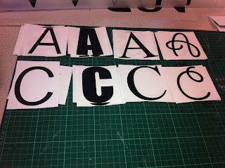
Today we were asked to use the letterforms we had collected at home. We had to bring in 'ABCD' upper and lowercase in gothic, script, roman and block. We had been asked to cut them out into 10x10cm squares ready for the session.

We were asked to put all of the letter 'C's to one side and concentrate on using the other letterforms instead.


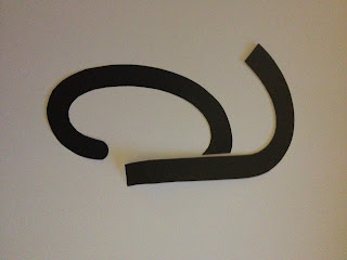
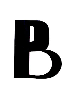
We were then asked to cut out each letter individually to enable us to create our own letterforms using the stems, crossbars and bowls from each example.


Below are a select few of my examples, I have chosen to show my most successful outcomes by ensuring that the background is as clear as possible, allowing each letter form to stand out.


Giddyup Std and News Gothic MT

Name of my font: Giddyup Gothic MT

Digital


Hand rendered


Digital


Hand rendered


Impact and News Gothic MT

Name of my font: Impact Gothic MT

Digital


Hand rendered


Digital


Hand rendered


Times New Roman and News Gothic MT

Name of my font: Times News Gothic MT

Digital


Hand rendered

Digital


Hand rendered


Impact and Times New Roman

Name of my font: Impact New

Digital


Hand rendered

Digital


Hand rendered


Giddyup Std and News Gothic MT

Name of my font: Giddyup News

Digital


Hand rendered


Digital


Hand rendered